
NOTE: I want to be upfront about what follows in this post. I was recently contacted by a promotional company, asking if I could mention a couple of their websites on this blog for pay. I agreed to do so, knowing that this is part of the SEO game.
While I normally wouldn’t accept an offer to just promote something, what caught my attention was that I was requested to make posts specifically because of their purposeful usage of manga and anime characters in marketing. I’m always fascinated by this topic, especially when it comes to Japan where cute fictional cartoon spokespeople are much more ubiquitous across all age groups. Because the types of mascots used can say a lot about a company and who they’re targeting, I decided it would be worth writing about.
I also want to emphasize that I have not used the service below, Hikkoshi More, so I can neither endorse it or advise people away from it.
I hope this makes everything clear.
—
In the English-speaking world we have sites like Orbitz and Hotels.com that aggregate various offers and prices and present them in one place, allowing users to choose from hundreds of offers. Hikkoshi More serves a similar function in Japan, except it’s for moving rather than traveling. Hikkoshi More is meant to help users to find the right moving company that suits their needs and finances.
I came to understand the purpose of Hikkoshi More because of the comic on their website, which explains what they’re all about. Sadly, it does not involve shipping the shipping companies, and is instead a parody of the Legend of Momotarou using the site’s mascots, Momoa (the girl) and Kuronishiki (the black cat).

In this story, “Kuronekotarou” is born from a peach and takes it upon himself to defeat the oni of Onigashima Island, but is beaten to the punch by the real Momotarou. The oni are forced off their island, and need to find a new home. Kuronekotarou introduces them (and eventually other character parodies from the Legend of Momotarou) to Hikkoshi More, and they all find homes.
The comic is actually pretty effective for giving an overview of what they’re about, and in my opinion was easier to get through than their actual website.

My personal favorite part of this manga is how Momotarou is kind of an asshole. In this panel, it mentions that he not only beat them up, he also took their money and credit cards. The fact that he carries a giant Nippon Ichi flag on his back (not shown above) adds to his ridiculousness. Also, because Momotarou is instantly recognizable to any Japanese person, it becomes an easy target for parody, similar to something like Snow White or Johnny Appleseed for an American.
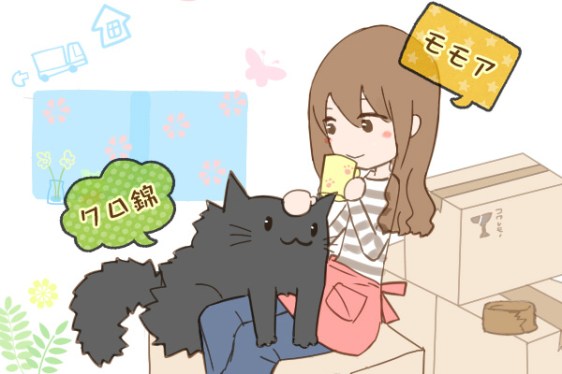
When looking at Momoa and Kuronishiki, it’s clear they’re mascots meant for regular adults. They have neither the high moe factor that would draw in more hardcore otaku, nor are they as generically cute as something like Hello Kitty. They’re drawn very simply, and Momoa’s design positions her as anywhere between 18 and 40, giving a sense of youth and vibrancy to the company without making her too young and thus unsuited for representing a site dedicated to a very adult concern of moving. Not that kids don’t care (they arguably care more than anyone), but they’re not responsible for the details of it.
I think people are more used to seeing the Dejikos and Hello Kitties of Japan than what Momoa and Kuronishiki are, which is simply cute and attuned to a more specific, yet not hardcore, demographic. The result is that Momoa and Kuronishiki are charming yet safe, and are perhaps a little more immune to the Erin Esurance syndrome. In that particular case, it was clear that Esurance wanted to use its mascot’s sex appeal to its advantage, only for the whole thing to explode in their face. Momoa might be closer to Flo from Progressive Insurance, if anything, except through that Japanese lens of kawaii.
