For a Truly Unified Front, You Need to Create a Unified Front

Let’s talk about the biggest news this past week: manga companies both in the Japan and the US have formed a coalition (literally the word they use) to combat rampant piracy of manga. Their targets are not scanlators, but specifically those for-profit megasites which house thousands of titles for easy reading online, such as Onemanga.

The issue of scanlation sites profiting off of the manga they house is not very new to the scanlation scene, with Narutofan.com and its owner Tazmo getting accused of duping people into paying for a subscription service for something which was available for free elsewhere, albeit still illegally. This newer, ad-driven model exemplified by Onemanga however is something else entirely, and it preys upon its readers by feeding in to their desire for “more” in as convenient a way as possible.

I’ll admit it: I’ve used sites like Onemanga and Mangafox before. They’re absurdly convenient, and I don’t even have to use up space on my hard drive to take a look at a series. So while I wouldn’t mind seeing these sites go, I think there are lessons to learn from their successes.

1) There has to be a way to profit off of online manga.

The issue here is that these sites are “for-profit.” It’s clear that they’re able to generate revenue, so there must be something that companies can take away from them, even if it’s just the method of displaying advertisements.

2) Companies should work together to create a single portal for legal online manga

One of the strengths attributed to the giant manga aggregators is that they have practically everything, or at least significantly more than any individual manga company’s website. They have scanlations, they have just straight-up ripped copies from official English releases, and they have a ton of each.

To compete with this model, I think all the manga companies, like Viz, Yen Press, Del Rey, the Japanese companies backing them, and even this new Open Manga thing, need to pool together their resources and create their own, legitimate manga aggregator. Even if it’s just a link to their respective sites, I think it’d be a very good idea to just have a single place curious readers can go to in order to see what’s out there.

3) Increase awareness, make people know that resources exist

The for-profit aggregators reach well beyond the  “manga fandom.” The first time I heard of Onemanga, it wasn’t from people who were knee deep in anime and manga, but from people who kind of read it on the side. Conversely, when scans of Vertical Inc.’s release of Black Jack appeared, some fans stated that they wished the series was licensed, despite the fact that copyright pages were scanned, and that the covers prominently display Vertical logos and the like.

A lot of fans aren’t even aware of what’s out there, or even that a lot of manga series are online through their licensed distributors. So going along with the idea of a single and legitimate manga aggregator, the existence of such a site needs to get pushed and pushed hard, to the point that word of mouth happens not just in anime communities but on facebook or wherever.

I don’t even think the word  “legal” should necessarily be used either. That doesn’t really factor into anyone’s enjoyment of media, anime or otherwise.

4) Get a better manga-viewing platform

One of the big advantages of a site like Onemanga is that it encourages both rapid and rabid consumption of manga. Their simple linked jpeg viewer makes it easy to just click page after page; you can even use the arrows on your keyboard to move through a manga.

Official manga viewers however, such as Viz’s flash-based viewer on sites like Sigikki have a lot of little things which require more effort to navigate, in contrast with the near-brainlessness of Onemanga. Yes, it can be chalked up to the laziness of fans, but it shouldn’t be about admonishing the readership. Once again, lessons can be learned.

Taking the Viz manga reader again as an example, there are a number of small difficulties which add up and make the experience less enjoyable. I have a small resolution on my monitor and I know that, while this is getting less and less common, it is a problem for a good number of people. When the pages are zoomed out, the text is impossible to read. When it’s zoomed in, I have to use my mouse to pull the pages around, and can’t even use the scroll wheel on my mouse to navigate.

Then there’s the matter of moving to the next page. In zoomed-out mode you can go to the sides of the page and an arrow conveniently appears, but when zoomed in this no longer becomes an option, and you need to use the buttons at the bottom to move on. Not only that, but chapters don’t link to each other. You have to go back to the previous page, find the link to the next chapter, and then wait for that to open up in a new window. Compare this with being able to use the arrow keys to navigate, and being able to click the last page of chapter 1 to move onto the first page of chapter 2.

Conclusion

I understand that it would be difficult for companies to negotiate with each other to create unified website, but I think it’s better than going things alone. A “coalition” is one thing, but I want to really see manga companies working together.

Talk About Kitty Cats: Vertical Vednesday

In about 12 hours there is going to be a Vertical Vednesday. It’s been a while since I’ve actually had the opportunity to go to a Vertical Vednesday, but today I will correct that mistake. I also apologize for telling people about this at the last second.

A Vertical Vednesday is a roughly monthly or bi-monthly meeting in Manhattan with Ed Chavez, the marketing director of manga and Japanese popular culture book publisher Vertical Inc. In terms of manga, their releases include Black Jack and To Terra. This latest VV is going to focus mainly on the English adaptation of Chi’s Sweet Home, the comic about an adorable kitten, but also other recently licensed stuff. If you are able to go, I highly recommend it, as Ed is literally the most knowledgeable person in regards to manga that I know. You’re bound to learn something.

The plan is to meet in front of Kinokuniya NYC (6th Ave between 40th and 41st streets) and then move to a location that can fit the size of the crowd. See you there!

I Thought We Liked Mahjong Series!

While Akagi and Saki were probably a lot of people’s introduction to the notion of manga based on the game mahjong, I don’t think I’m alone when I say that my first introduction to “mahjong manga” was from Frederik L. Schodt’s seminal book Manga! Manga! The World of Japanese Comics.

In it, Schodt explores the burgeoning genre and talks about popular titles such as Mahjong Houroki (“Tales of a Wandering Mahjong Player”) and Jigoku Mahjong (“Mahjong Hell”), even citing the author of Mahjong Houroki, Kitano Eimei, as the sort of “father” of mahjong manga, who showed that a comic about dealing tiles could look and feel exciting.

Truth be told, while I was fascinated by the idea of mahjong manga back when I first read Manga! Manga! ten years ago, I am not so different than the people who discovered it through Akagi, as that was the first mahjong series which I actually had the privilege to see. And while I don’t expect mahjong manga to become a runaway success in even the scanlation community, it’s clear that it has its devoted followers.

Here’s the odd thing though: Where are the scans of Mahjong Hourouki? If Akagi and Saki have resulted in people from all over the fandom getting into mahjong even at a periphery level, why hasn’t anyone bothered to look into these significant works which established the genre that so many are enjoying now? And it can’t really be the case where fans of these newer series might not like the older series due to the artwork. After all, we’re talking about Akagi fans here, and I’ve never seen anyone proclaim, “If the characters don’t have ultra pointy faces and noses and everyone looks shocked all the time, then I refuse to read it!” And I see you considering making a comment where you reiterate what I just said. I’m watching you.

Oh, and of course the reason I’m talking about it in the realm of scanlations and such is that no sane company would license a mahjong series in the United States. The closest you’d get to one that could conceivably do well is Saki which is streamed on Crunchyroll, and even that is a bit of a stretch when you consider the not-internet.

The most likely culprit is probably scarcity. It’s no doubt difficult to find these old series in the first place, especially with a niche genre like mahjong. And I’m as guilty of not contributing to the pursuit as any other. This is the first post I’ve made about it, and it’s only because I was re-reading Schodt’s book today. But still, I’m making the call out. We have to find these old works, titles like Mahjong Fuunroku (“Mahjong Crises”) and Gambler no Uta (“The Son of the Gambler”), and bring them to the forefront of consciousness.

Nonexistent Rationality

In light of the Handley case’s conclusion and the recent measure in Tokyo to outlaw sexually provocative imagery of characters 18 and under to protect “nonexistent youths,” as well as the subsequent opposition by manga creators from all over Japan, I’ve felt an increasing desire to state my thoughts on the whole situation. I’m not really anybody who can affect a change, particularly when it comes to the Japanese government, but I still want to say my piece.

Before I begin, I want to explain my stance on objectionable art so that you can understand where I’m coming from. Ask two different people from similar upbringings to list their sexual kinks, and you would likely see differences in their answers. People’s sexualities are very personal things, and often times people cannot help what they are sexually attracted to. They can ignore it, they can actively avoid situations in which they are exposed to it, and being confused about their own sexuality can lead a person to think they’re into something they’re really not, but sexual attraction, to whatever it may be, will be there.

And so you’ll find situations where something one person finds sexually attractive will be absolutely repulsive and morally reprehensible to another. It is not absolutely not wrong for a person to feel disgusted with something that makes them highly uncomfortable, and it is their very right to think less of anyone who finds such a thing arousing. However, it is my belief that laws should not be passed based simply on the fact that something is seen as creepy or disgusting. Laws should not be carried by emotion alone. In order for it to be a crime, there should be a real risk of harm, be it physical, psychological, monetary, or some other form to another individual, something that makes it more than just a “bad feeling.”

With that in mind, I want to get into the main thrust of why this bill to protect “nonexistent youths” is so dangerous should it pass. Simply put, it is too broad in its scope and so vague in its language that it can encompass pretty much anything. It is based too much on vague “feelings” and is inherently flawed.

Pornography is one thing, but the proposal extends to all potentially sexually provocative portrayals of characters 18 and under. That covers a lot of ground. Let’s take a classic example of something easily sexualized which is also a part of everyday life: the short skirt. How short does it have to be in order to be considered sexually provocative? What is the threshold? Is it the standard length for a Japanese school uniform’s skirt? In that case, I don’t think I have to tell you that there is a sizable population that would disagree with that. In that case, let’s just get rid of all short skirts on minors in manga and anime. But even long dresses can be deemed sexually attractive, possibly more than short skirts, depending on the individual. The same thing applies to getting rid of dresses and skirts entirely and replacing them with pants. Forbid sexually provocative imagery? I can only believe that the people who drafted this proposal have no idea how powerful the human imagination can be, especially that of a horny teenager.

The teenager is also an important individual to consider with this proposal. The idea of removing fictional portrayals of people 18 and under that could be deemed sexually provocative feels like a myopic decision created in the world of adults. The proposal is there to prevent adults from looking at underage characters in a sexual manner, but not everybody reading manga is an adult. And while I know that it is difficult to determine age based on a drawing given the sheer unlimited possibilities that can occur when pen is put to paper and an image is created, let’s just assume for the sake of argument that we discovered a way to 100% accurately portray the age of a drawn character, that the 16-year old on the page is 16 years old. If you consider the reader to also be a 16-year old, then it would only make sense that they would be sexually attracted to that character, that a 16-year old can be sexually attractive at all. Yes, there is a risk involved with attracting people who are much older than teenagers, but if we were to apply that logic to the real world, to “existent youths,”  it would be as if teenagers were being told that they weren’t allowed to look attractive because there’s a risk people outside their age group might find them attractive as well, or saying that people 18 and under cannot look attractive at all. Again, when taken from a purely adult perspective, it’s easy to see why this would make sense, but not everyone in Japan is an adult, and not everyone reading manga is over the age of 18.

Taking a broad view of censorship, artists and creators will push the limits of censorship as far as they possibly can, no matter how strict or severe the censorship may be. Genitals are censored in Japanese pornography, but their porn industry has found a number of ways around the “mosaic.” Some companies push the limits of pixel size in the mosaic, boasting that their mosaics are extra small, while the very concept of bukkake possibly stems from the goal of showing evidence of the male genitals without actually displaying them. If a limit on skirt length really were to be decided and skirts were deemed “okay”  if they were less than 4 centimeters above the knees at most, then some manga creator or artist out there would make sure to point out that a girl’s skirt is 4.000001 cm above. It’s one thing to set a limit and say, “this is the point you must not cross,” but to try and prevent anything sexual from being portrayed in visual fiction is a losing battle forever thwarted by the endless creativity of artists.

Manga Criticism Translation: “At First, I Wanted to be a Manga-ka”: Analyzing the Nausicaa Manga by Kumi Kaoru, pt 2

Blogger/Translator’s Note: This is the long-past-due followup to the translation posted by kransom over at his blog, welcome datacomp.

As stated by kransom, the translation is based on a lecture by freelance writer Kaoru Kumi and included in a book he has written about Miyazaki. More information can be found in the introduction of part 1. For the sake of consistency and other things, all names in the essay are first name first, unlike my usual style.

Incidentally, just as we have translated his writings from Japanese into English, Kumi has translated an English book into Japanese, “Astro Boy and Anime Come to the Americas” by Fredd Ladd and Harvey Deneroff. More information about the Japanese translation can be found here, and you can purchase the original version from Amazon.

So without further ado, Part 2.

___________________________________________________________

Actually, the Nausicaa manga also frequently uses these techniques to create a sense of smoothness between panels, the difference with Yotsuba&! being that the sequence from Nausicaa relies on speech, while the one in Yotsuba&! relies on sound in order to keep the flow continuous. In short, this sequence utilizes a spoken word to smooth the sensory incongruity between the two panels.
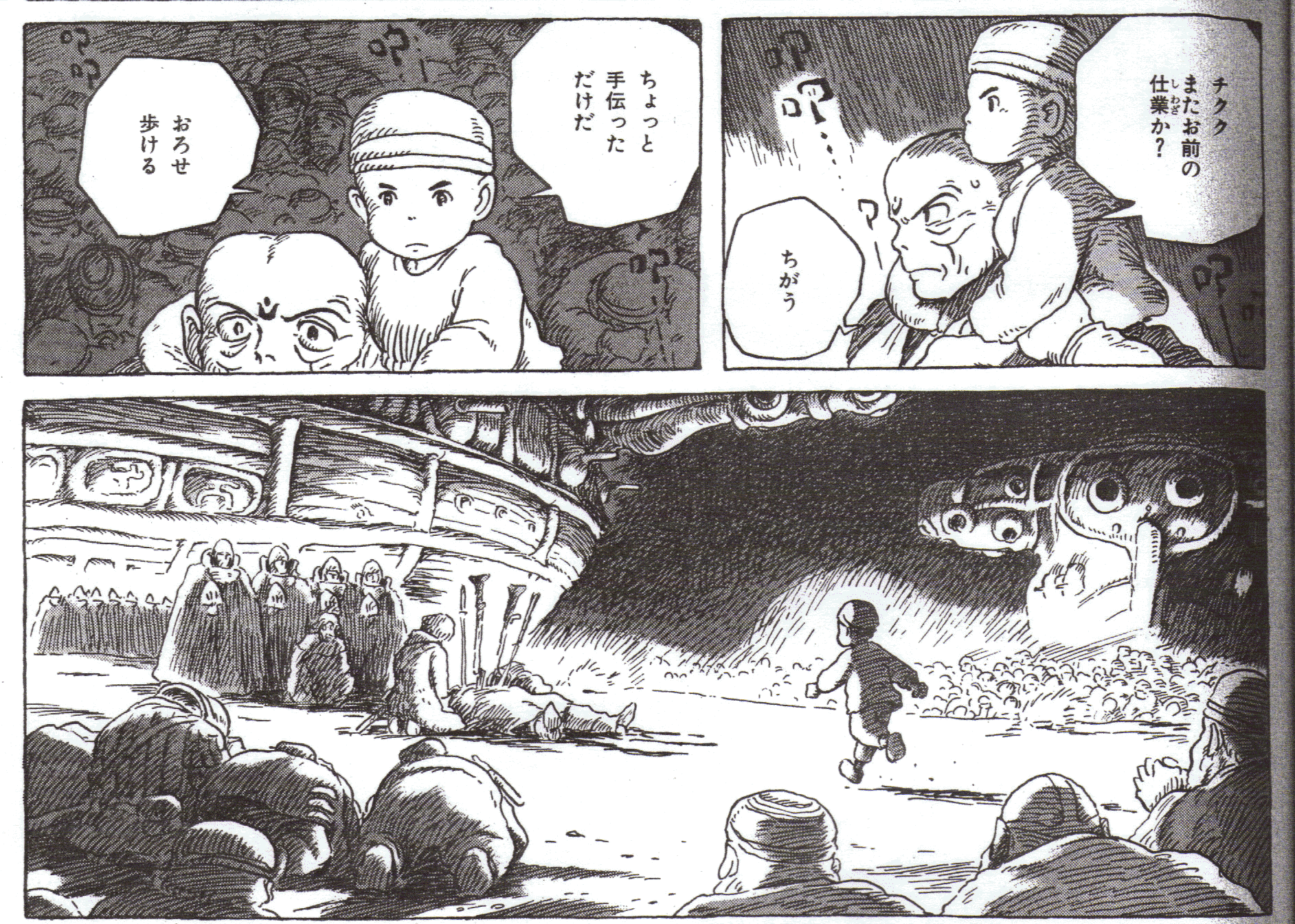
Volume 7 p.83

This is the impressive scene where Master Yupa steps in to stop the conflict between the citizens of Dorok and the remnants of the Tolmekian Army at the cost of his own life. Panel 1 and 2 show the boy witnessing the death of Yupa while being carried on monk’s back, while Panel 3 shows him rushing over to Yupa. Here, the cut between Panel 2 and Panel 3 is B’. With a B’ cut however, there should fundamentally be a continuation of the overall action, as is the case with the prior example of Shirley, which is covered by the action where the young maid quickly makes a cup of tea for her master. However, in this example, with panel 2 you have the boy sitting on the man’s shoulders without moving, and then with panel 3 he’s running. Technically, his overall action has been interrupted between these two panels.

However, you can see a line of dialogue in panel 2 where the boy says, “Put me down. I can walk.” Thanks to this line, the overall action is continued. Let’s try covering up the line, if you like (Here, the lecturer puts is hand over the projector to cover the words “Put me down. I can walk.”). Even with this, there’s nothing hindering the transition between Panels 2 and 3, but now don’t you sense something amiss? It’s like a baby stroller being pushed along and then suddenly hitting a bump in the road. But when you add in the line, “Put me down. I can walk,” (moves hand away) now it becomes smooth. The overall action of “rushing over to Yupa” continues in panels 2 and 3. In other words, B’ is established here. I think it subtly proves that Miyazaki cares a lot about having his readers enjoy Nausicaa and has a good sense of what will improve that enjoyment.

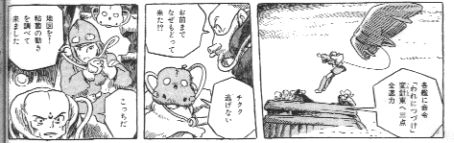
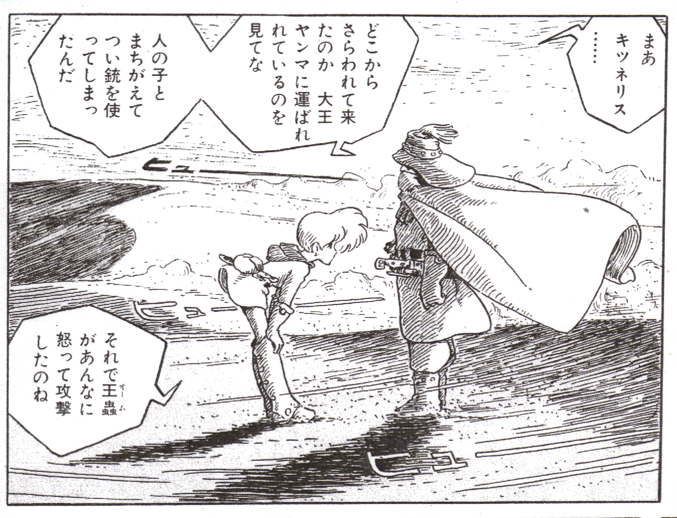
Nausicaa also has a clever use of Pattern B”. Let’s see the beginning of the old edition of New Treasure Island once more. If you compare the two, you will find that the two use the same Pattern B”. Here, Nausicaa and Chikuku are returning to a Dorok airship via air. In New Treasure Island the vehicle runs along hastily, while in this scene from Nausicaa, Nausicaa, Chikuku, and the monk are in a rush. That’s right, they both fall into Pattern B”.

Volume 5 p.62

“You’ve come back, too!?” “Chikuku won’t run away!” “A map! I’ve traced the movement of the mold.” “This way!” [CL1] These three panels look perfectly continuous since their dialogue goes on, in spite of the discontinuity in physical action in these panels. It’s the same technique as the one in the three-legged race I referred to earlier.[1]

Speaking of Pattern B”, I know there is another example in Nausicaa.
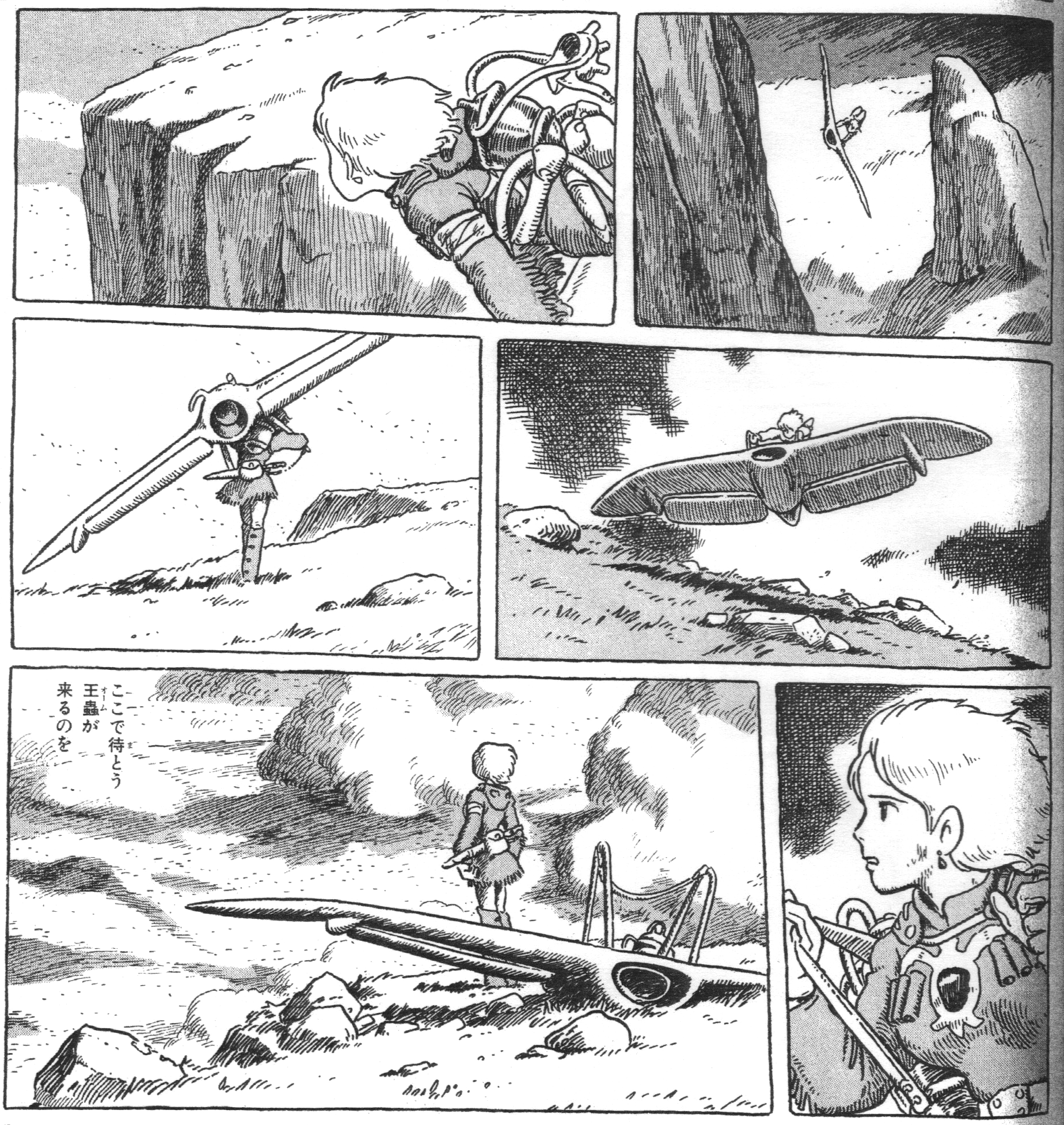

Volume 5 p. 87

The world of humans is on the verge of destruction, and with Teto in tow Nausicaa goes on a solitary flight. She lands on high ground and decides to wait for the army of Ohmu, who know the key to the situation at hand. The action in these six panels is not continuous, and so one might determine these panels to be an A” sequence[2]. And yet, you can follow these panels smoothly, as if you were watching a movie, in spite of the lack of speech or sound to give you a sense of continuity. Actually, while these panels do not follow Nausicaa’s actions continuously, including how she lands on the ground and how she shoulders her kite, you can still follow those actions smoothly because the overall action of ‘her swooping down from the sky and landing near some high ground and then walking towards it’ remains continuous, or is uninterrupted. And so you sense that they are still continuous. This is Pattern B”.

Let’s look at another example of B”.

Emma Volume 5 (Mori Kaoru/Enterbrain) p.76-77

This is Emma. I’m impressed with this author, who takes a total of four pages just to draw Emma changing into her maid uniform. However, when you look at it, the omissions in the actions that happen from panel to panel are assuredly there. If the sequence were to be drawn in its entirety, a mere four pages would not have sufficed. When you read it, however, it looks perfectly continuous. The overall action of “changing from plain clothes into maid clothes” is done consistently, and the small actions which are not drawn instead take place in your head and complement the action. This is a typical example of Pattern B”[3].

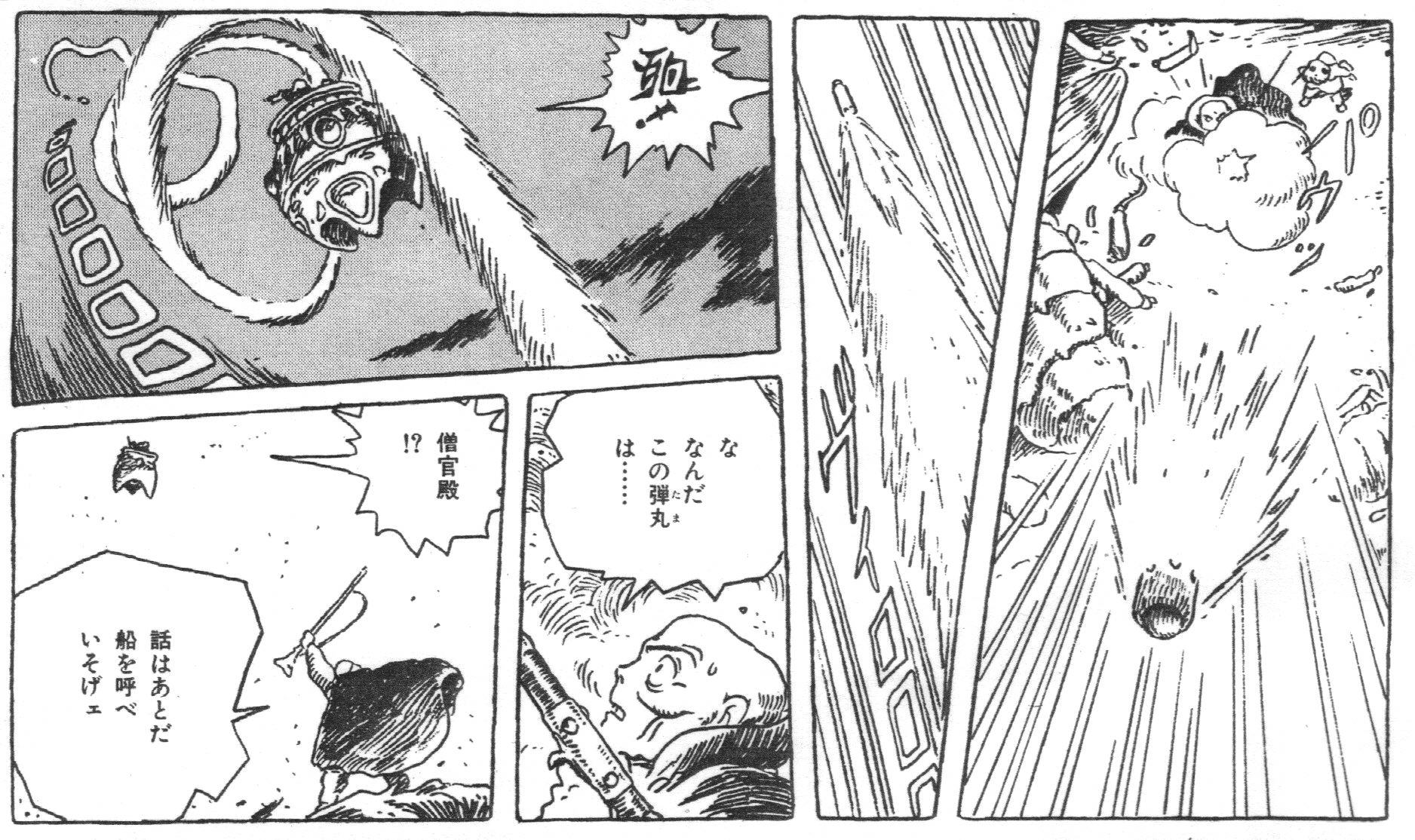
By the way, recall that earlier I explained how the Pattern B you see in movies theoretically cannot be replicated in manga, and that in order to do so you would need some way of falsely approximating the process. Actually, it is not impossible. Here, the monk points his gun at the sky and fires. Then, the subordinates up in the sky make their presence known.

Volume 4 p.124

The sequence from Panel 2 to Panel 3 is key here. If you were to put this into a movie, in panel 2 the bullet would appear to be flying OUT of the screen, and then a cut would happen. Then, in panel 3 you would suddenly see the bullet flying, or, to put it differently, you would see the bullet flying IN when the officers in the sky riding the flying turtle are startled by it. That’s the exemplary editing it would need if it were put into cinema. Simply put, this is a Pattern B sequence. Pattern B may be theoretically not replicable in manga, but take a good look at Panel 3. The trajectory of the bullet is shown by the smoke trail. “Wha… What kind of bullet was that?!” [CL2] exclaims the astonished monk. Indeed, it’s a little more like a rocket. Thanks to this however, you can now tell with just one look that Panel 3 is an IN shot. Wow, this is definitely like a B sequence from a movie!

Incidentally, this kind of smoke is associated with the “action lines” which you might remember from Zipang, where it is used in aerial battles. Contrasting with the physically impossible and fanciful assemblage of lines, the smoke in Nausicaa has a physical existence. It does not feel insubstantial, but rather actually quite real and natural. If we analyze the transitions in those five panels, they are A’ B’ D’ A’; in other words, they are all single-dash (‘) sequences and not double-dash (”) ones.

Miyazaki’s composition of these panels is so awfully sophisticated that I’m terrified, but the examples I’ve drawn upon so far have been from when Miyazaki’s manga had been serialized for a while and he was establishing his own form of manga syntax, and not at the point when he first began serialization, back when his refinement was still lacking. Take a look here at the first page from Volume 1.

Volume 1 p. 9

I touched on it just before, but the second image here is unusual for Nausicaa in that the rectangular panel does not have a border. Actually, when it was published in Animage originally, the title logo for Nausicaa of the Valley of the Wind was inserted here. When it was being collected together for the tankobon, Nausicaa flying with the glider was drawn in, and so the edit from panel 1 to panel 2[4] is not B” so much as it is B”-. It’s the same as the beginning of the revised edition of “New Treasure Island.”

Now what’s a good way to explain the transition from Panel 2 to the giant skull in Panel 3? In a movie it would be a B. You’d think then that it would be a B’ sequence, but when you compare it to the way the bullet was handled in the panel I mentioned earlier, I must say it looks less sophisticated than a typical B’ scene.

And then, doesn’t the edit from Panel 3 to Panel 4 feel abrupt? First, some of her actions seem omitted. 1) The glider lands -> 2) Nausicaa pulls the gun from the glider -> 3) Nausicaa carries it on her shoulder -> 4) Nausicaa faces the Sea of Corruption and walks (Here, the lecturer demonstrates the way in which Nausicaa walks). That is how Nausicaa is supposed to act in this sequence, but three out of four of her actions have been removed. Moreover, while in Panel 3 she was gliding very close to the skull, in Panel 4 the scene is set at ground level, and so they cannot be A, B, or D. So, is it supposed to be C? No, because Pattern C is a scene change, which usually does not have the continuous presence of the same subject.

So then, what exactly is the sequence in these panels? If I had to explain it, I might venture to say that it’s like the old version of “New Treasure Island.” That is to say, it can be categorized as B”. However, there we have the consistent action of a moving vehicle. In this page of Nausicaa, the glider vehicle’s action is interrupted. Perhaps, if Panel 4 illustrated the glider flying towards the Sea of Corruption, it would be a smoother sequence, although Nausicaa would crash right into the tree trunks! (laughter) …even if it would be a smoother sequence.

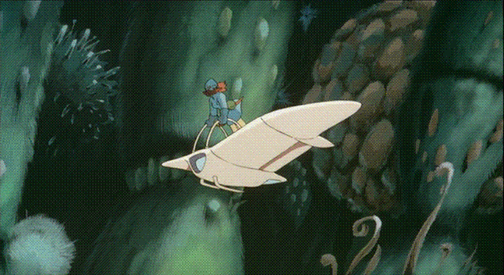
Here’s the same scene from the movie version. Here, it is incredibly smooth.

1

2, 2’, 2’’

3, 3’

4

5

6

Nausicaa sweeps over the giant skull (1) -> Nausicaa prepares to land very close to the Sea of Corruption (2)~(2)” -> Nausicaa makes a soft landing below onto the sandy surface (3)~(3)’ -> Nausicaa pulls the gun from the glider (4) -> Nausicaa hangs it over her shoulder (5) -> Nausicaa walks towards the Sea of Corruption (6). They are edited in quite a normal fashion. But when you see this and then look at the same scene from the manga, you find that the sequence from the manga has less elegance to it in comparison. It suggests that Miyazaki was unsure of how to transfer and convert movie syntax onto paper when he began drawing the first chapter[6]. Also, the first chapter was 18 pages. With only so many pages, the complicated sequences where Nausicaa appears, wanders through the Sea of Corruption, reunites with Yupa, and then flies to the Valley of the Wind—a sequence which in the movie takes 15 minutes—has to be drawn, then the panel sequences would inevitably feel crammed and rushed.

If you were to again look over this first serialized chapter, you’d wonder why, despite the fact that the drawings are made to be dense, does the comic look so stark-white? Really, why? After thinking about it, I realized the answer: there are no screen tones being used. Do you understand? I brought some with me today. Can those sitting in the back see this? It’s a somewhat thin, net-like sheet. There are dozens of varieties of these, and they’re used by nearly every manga artist, cutting and pasting them onto their manga in order to create effects such as shadows and clothing patterns[7]. But in the first chapter of Nausicaa, all shadows are hand-drawn.

Volume 1, p.19 (with close-up)

With that, it’s pretty white. But actually, in the comic a bit of screen tone does get used.

Volume 1 p.26 (with close-up)

This is a close-up of Yupa’s face. Notice the shaded area. On top of the thin lines drawn here, a layer of screen tone is pasted onto it. This is the last page in the serialized chapter 1.

There are other instances of Miyazaki’s process of trial and error showing up in his drawings.

Volume 1 p.23

Nausicaa here is running with a big smile on her face. This same scene is also in the movie, but in the manga the scene has more of a slow-motion feel to it, and gives the impression of being a slowed-down moment. This is the weakness of B”-. Here, Nausicaa is sticking out of the panel, and is quite possibly Miyazaki’s deliberate attempt to reduce the slow feeling here. This technique, called “off the panel,” is incredibly common in Japanese manga, but this is the only instance[8] of its use in Nausicaa. “How should I draw a manga?” Miyazaki probably asked himself as he was holding a variety of manga magazines in his hand, and tried his hand at making something “off the panel.” Miyazaki had most likely not yet developed his own methodology as of chapter one.

Such is also the case with this panel, where if you look at it after you’ve come to know Nausicaa it seems unpolished.

Volume 1, p.24

First, the use of the “hyuu” sound effect and the streamline seem rather forced. Second, the scene composition gives the impression of unsophistication. For a genius layout man like Miyazaki, the scene is too loose and incomplete. Why is that the case? Well, it’s because too many words, or should I say “speech balloons,” have been crammed into the scene. Later on, Miyazaki would use a multitude of panels to handle such a scene, but I think here Miyazaki decided to depict their conversation only for one panel because Nausicaa and Yupa are holding still. There are many speech bubbles in the panel, so the scene feels relaxed.

And so on and so forth. In chapter 1, examples of Miyazaki’s trial and error are everywhere. “There’s a lot I want to talk about, a lot I want to convey, but I am not trained enough to put what I really want to tell into manga. This is so frustrating!” thought Miyazaki, I suppose. However, the second chapter is much more stable. And listen, ladies and gentlemen, he finished the second chapter not in pen, but in pencil! When the first manuscript for Nausicaa was handed over, the Sherlock Holmes (aka Sherlock Hound) project was given the go-ahead, and so Miyazaki no longer had any time to draw manga. However, Animage persuaded him to continue the series, with Miyazaki finally agreeing to do so, on the condition that he could draw the Nausicaa manga in pencil because it enabled him to finish it more quickly. Nausicaa, as a result, became the first commercial manga ever drawn in pencil.

Volume 1, p.35 (with close-up)

One of the unique characteristics of the manga version of Nausicaa is how the shadows are rendered by drawing a series of thin lines. This is influenced by the French comic artist Moebius[9]. Look at the right image. You can see that these shadow lines are chipped subtly. That’s because it’s drawn in pencil (laughter). For your information, Miyazaki seems to have used a variety of pencil types, including a B and an H.

But then around the second half of the second volume, the comic goes back to being in pen. Now I might have this wrong, but I get the feeling that even after that it occasionally goes back to being in pencil. Here, for example.

Volume 3, p.41 (left) Volume 3, p.42 (right)

For the sake of the Nausicaa movie, the manga’s serialization was put on hiatus. The image on the left is a panel from the final page before Nausicaa was put on hiatus, and the image on the right is from the page right after serialization resumed. In the collected volume (tankobon), they’re printed on the same piece of paper, one on the front and the other on the back, but in reality there was a 13-month gap. Now if we were to magnify the dangling ends of the gas mask…

Do you see? The lines in the image on the right are more chipped. This means it’s a pencil drawing. You might know that in animation key frames are drawn in pencil, and so while making the Nausicaa movie, Miyazaki became more attuned to using pencil. I guess after the manga resumed, he was unable to draw with a pen the way he wanted to, and so after the manga started up again, the first new chapter was done in pencil. But then in the next chapter, the comic goes back to being in pen. Incidentally, when he resumed the Nausicaa manga after having completed the movie Kiki’s Delivery Service, the lines look a little chipped. I think that it was also drawn in pencil. Then, it returned to pen.

Now we’re going back to analyzing what it means to be “cinematic.” Having the background be out of focus is a technique frequently used in live action film, or should I say, photography. Suppose there were many little flowers blossoming and you attempted to use your camera to shoot one of them very closely. However hard you tried, the shot would get crowded by the other flowers. For that reason, you have the camera focus on just the one flower and leave all of the other flowers out of focus (Lecturer projects it on the screen). This is a terrible example though, granted (laughter).

The “out of focus” method is also in Nausicaa.
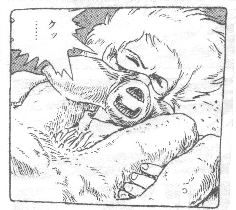
Volume 2, p.116

This scene is the duel between Yupa and Asbel. It’s an action scene, and yet it’s more akin to stopped motion. In my opinion though, I wouldn’t call it stopped motion so much as the removal of sound.

Look at this scene from the Nausicaa movie (DVD playback). A giant transport vehicle crashes into the Valley of the Wind. By the window is a girl who looks the same age as Nausicaa. The sound disappears in this cut. Movement in this scene hasn’t stopped, and yet doesn’t it seem like time has stopped for an instant? The panel in question, the one with Yupa and Asbel, achieves the same result on paper, although this scene was drawn before Nausicaa was ever turned into a movie. It is said that Takahata, who joined the production of Nausicaa the movie as a studio manager, worked as the sound supervisor as well and removed all the sound in this cut. His sound removal method must have impressed Miyazaki, as Miyazaki applied it to the Nausicaa manga in a more refined way later.
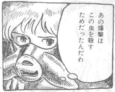
Volume 3, p.139

Here, Nausicaa is fleeing from a Dorok cavalry. Of the guards who are desperately covering Nausicaa with their bodies, one of them gets hit and falls over. It’s quite exciting. At the same time, the lack of a rendered background emphasizes her psychological shock and as a result gives off a sense of stillness, a sense of stopped motion [10].

The overlap technique seen in films is also used. It’s not used that often, but if you take a look here:

Volume 5 p.75

For some reason, the monk has a worried look on his face, and Nausicaa appears behind him flying. Drawing an image like this on paper is a little too bold, but in actuality the image does not feel out of place. In other words, it reminds us just how heavily we have adapted ourselves to the scene dissolves that occur in movies and television.

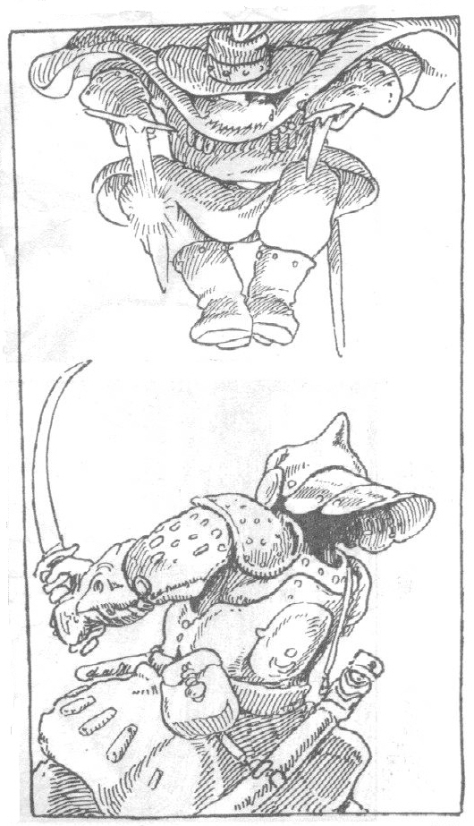
Speaking of which, this is a manga which faithfully uses rectangular panels. There are, however, exceptions, like here.

Volume 3 p.13

This image brings back some memories from when I was in elementary school, especially the illustrated encyclopedias that would be available in the school library. Boys who are into science or technology like illustrated encyclopedias, and a young Miyazaki would be included among them. (laughter). Now have a look.
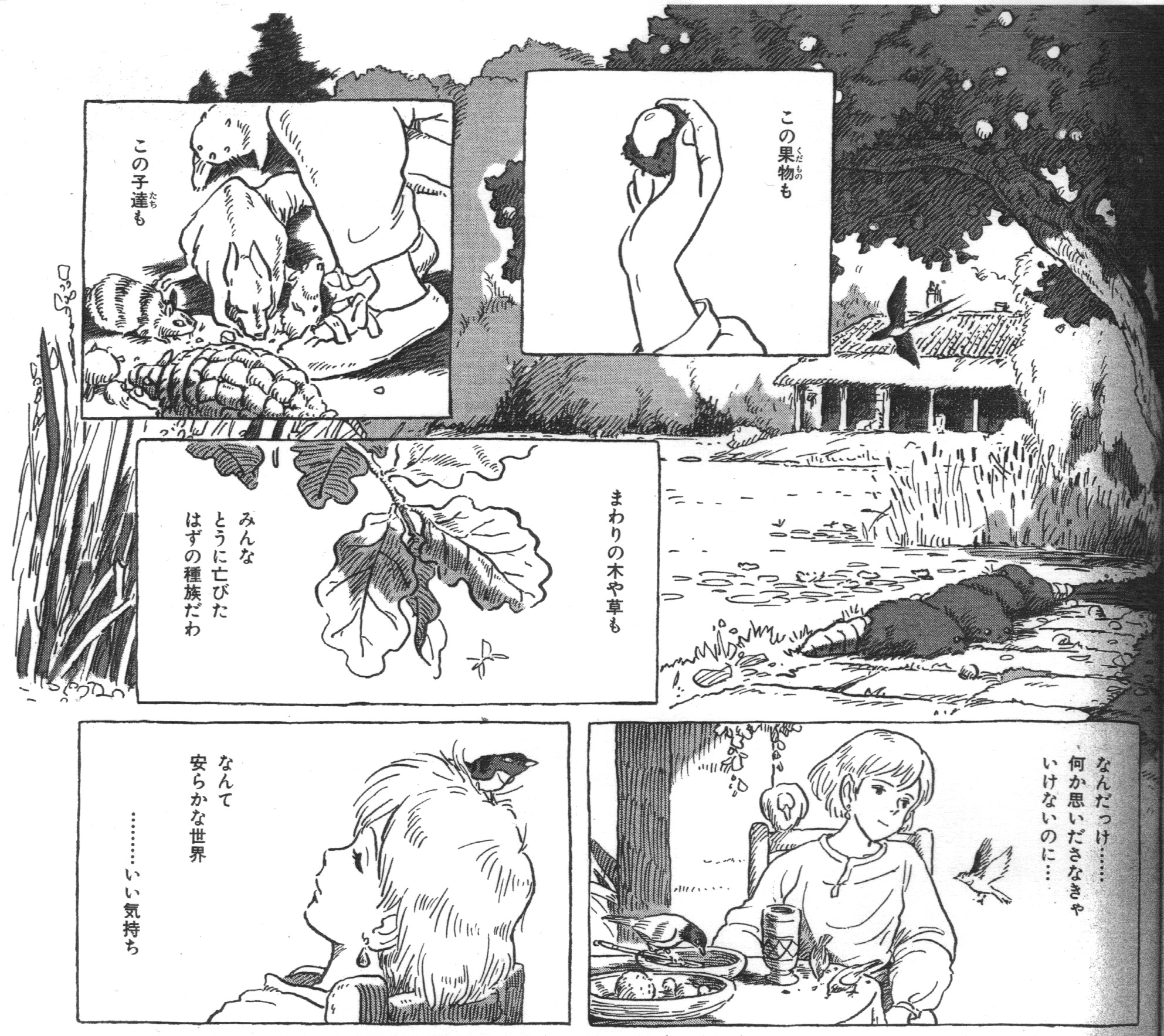
Volume 7 p.105

Oh! Here we have Nausicaa relaxing with a silly look on her face (laughter). She’s forgotten her usual self-denial and self-restraint, feeling quite relaxed and refreshed, with the image of the garden bleeding past the edges of the page as if to reflect the calm in her mind[11]. The author wanted Nausicaa to relax for a short while. After this, she would be sacrificed to a journey filled with despair…

…Which is my own humble analysis of Nausicaa. Seeing this manga, I’m impressed that almost all of the panels are rectangular, something quite unusual for modern manga, while each of those panels is packed with the passion and energy of such an extraordinarily talented creator. This gives off the impression that Miyazaki was holding back. As he was most likely extremely conscious of how the movie’s sequences and transitions would be edited, the activity in the actions from panel to panel, in other words A”, are united with the context of words and dialogue. In short, Nausicaa is the manga which blends cinematic methods exquisitely into classical manga syntax.

Miyazaki learned Disney-style full animation at Toei Animation, and then left the studio where he and his comrades ended up falling in labor union activities. He and Takahata joined the TV cartoon industry, trying to achieve maximum “cinematic” efforts using lower budgets and fewer animated drawings. In his autobiography, veteran animator enthusiastically writes about how Miyazaki had been living his vision.

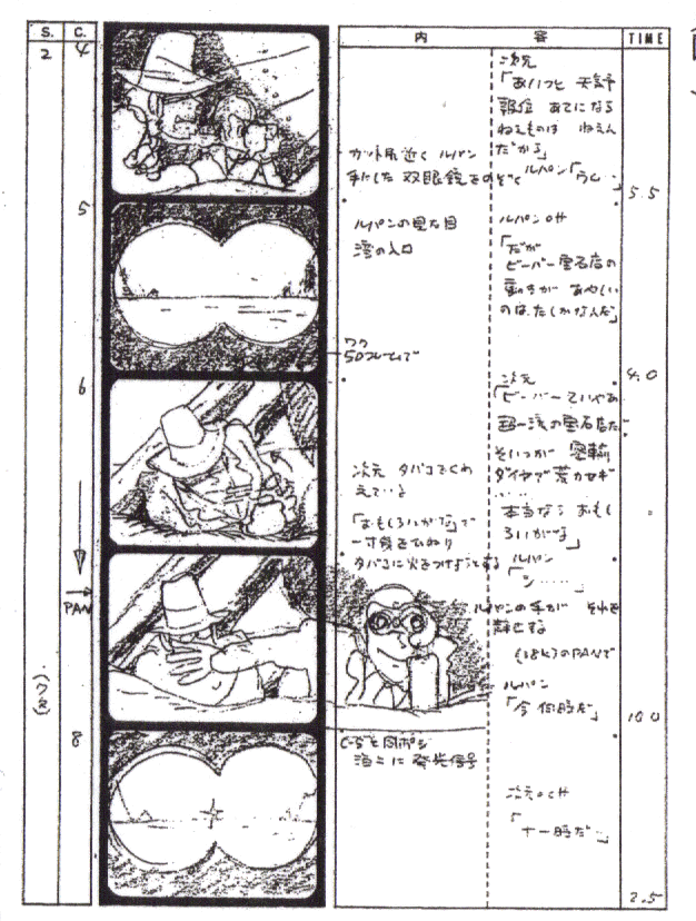
This is Miyazaki’s storyboard from the 1971 Lupin III[12]. Otsuka compares Miyazaki’s storyboard with one done by a different animator. If we look at this other storyboard done by someone we’ll call “Mr. X…”

The Animator Clawing His Way (Sakuga Ase-Mamire),
Revised and Expanded Edition by Yasuo Otsuka,
published by Tokuma Shoten Publishing, p.149

…there’s an A cut. However, with Pattern A, the action must be continuous, which makes drawing the images for it labor-intensive. Miyazaki’s storyboard on the other hand is entirely D edits. If the action isn’t continuous, then the drawings become easier to do, all the while Miyazaki remains perfectly faithful to the principles of film editing.

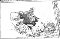
Looking at the Nausicaa manga more closely, not only can you see that the D’ sequences are well-done, but that there are a lot of A’ sequences (with actual A sequences being impossible). When A sequences appear in TV anime, a character’s actions must be singular, and it must be a simple action—like an arm extending—to shorten the amount of labor put into the drawing. Manga, however, is by nature a series of still images, so with Pattern A’ or even Pattern A”, the readers will conceive the movements in their heads. Showcasing clever uses of this mental mechanism is the air battle scene I showed you earlier. In Panel 8, the gunship is depicted flipping like a springboard diver jumping backwards into water. If you were to actually try to animate it, the process would have been laborious and would have required many frames of animation to be drawn. However, because it is manga, the complementary actions are envisioned mentally by the reader, where less labor is needed than in drawing animation frames, and so it becomes an easier task.

Thus, what you have here are the patient efforts of Japanese animators over dozens of years to make TV cartoon shows as fully cinematic as possible in spite of difficult circumstances in production, as well as the brilliant efforts of Japanese manga artists over dozens of years to achieve cinematic style on-paper in spite of the fact that manga is just composed of still images. One of the most brilliant fruits of their labor is the subtle and bold fusion of the two sides that is Nausicaa of the Valley of the Wind. That is my conclusion. (Applause) What? Why are you all clapping here? (Big laughter, huge applause) I’m grateful! Oh, don’t you think NHK will have to invite me as a guest commentator whenever they have their “Manga Night Talks” show about Tezuka’s New Treasure Island? (laughter).” Not that Tezuka Productions would ever give the OK on it, even though this is the 80th anniversary of Osamu Tezuka’s birth[13] (laughter).

Next week, we’ll continue to discuss Nausicaa. This time we discussed technique in depth, but next time we’ll be analyzing and getting at the core of its story and themes. I hope to see you all in this classroom next week. Class dismissed.

Footnotes:

[1] It goes without saying that the three-legged race I mentioned earlier is A”. However, the two girls’ swing of conversation fills cinematic gaps among the three panels.

[2] Notice how in panels 1~5 there are no speech balloons, sounds, or entire figures. On the other hand, you have Footnote 9, or “Osaka splitting her chopsticks apart,” where sound and figures make it easier to follow the panels smoothly, as if it were cinematic.

[3] In an interview, Mori mentions liking this sort of panel sequence.

[4] For the sake of convenience I called this “panel 2,” despite it having no actual borders.

[5] Actually there’s another solution here. If one were to insert a panel of Nausicaa preparing to land in between panels 3 and 4, it would become B”.

[6] I also referenced Yukihiro Abeno, who said, “Miyazaki is the ultimate and most fortunate amateur manga author.” (Seidosha Publishing, Eureka Special “World of Hayao Miyazaki” Issue)

[7] The first time this was used in a manga was by Miyomaru Nagata. Around 1955 or so.

[8] An omission.

[9] Moebius, born on May 8th, 1938. He is famous for having influenced the styles of Katsuhiro Otomo and Hayao Miyazaki, and apparently Moebius style had an influence on Tezuka’s Hidamari no Ki, the samurai drama featuring Tezuka’s ancestors. As an aside, Moebius named his own daughter “Nausicaa.

[10] In Nausicaa, when an action scene occurs the closing line in the panel becomes diagonal.

[11] I believe this technique of piling fragment-like panels on a larger, non-bordered image was first used in Japan by Shotaro Ishinomori (January 25, 1938 – January 28, 1998).

[12] At first Satoshi Dezaki drew the storyboard for the sequence, but Miyazaki rejected it and drew this afterwards. Though keep in mind that Dezaki was not “Mr. X.” In fact, the second storyboard on this page was drawn by a younger animator whom Otsuka got to draw it years after the production of the first Lupin.

[13] The old New Treasure Island was finally re-released on February, 2009.

Summer Wars Tomorrow in NYC

Regretfully it’s too late to buy tickets now so for those who were unaware of this event in the first place I extend my apologies, but I will be attending the New York International Children Film Festival‘s opening night showing of Hosoda Mamoru’s Summer Wars. I’ve been highly anticipating this movie, especially because the year I attended my first NYICFF was when I saw his previous film, The Girl Who Leapt Through Time.

I am going in blind. I have no knowledge of Summer Wars whatsoever, not even its basic premise, which should tell you a thing or two about how high my expectations are for this movie. Am I setting myself up for disappointment? I highly doubt it, but we’ll see.

Hosoda Mamoru himself will also be there, and it will truly be an honor. The last time I went to a showing where the director was there was for the Otokojuku movie. While I don’t expect Hosoda to be putting on a display of swordsmanship, I really hope the audience is able to deliver some solid questions. I know I’ll be there with my hand raised.

Our Unique Approaches to Anime

It sometimes amazes me just how many ways there are to approach a given creative medium or product. When we look at a piece of art or fiction (or non-fiction!), we bring with us all that we prioritize and seek in works. Even when the focus is on just anime and nothing else, the result is a plethora, possibly even a panoply of differing viewpoints, each with their own inherent sense of validity.

At Otakon 2009, Yamamoto Yutaka, director of Kannagi, mentioned his praise for Studio Ghibli’s Takahata Isao, and how Takahata’s classic TV series Anne of Green Gables is essentially the gold standard of how a long TV series should be. Yamamoto is also known for being an anime critic, though his opinion can be difficult to comprehend. But then you realize that he looks at anime from that director’s perspective, and that his priorities are less on the content or themes or story  of the work and more about how scenes move into one another, how well it all conveys the idea.

Narrowing the focus a bit brings forth the notion of watching anime for the animation, and Anipages is probably the best example I can think of for someone whose focus is mainly on the “moving image” aspect of anime. It affords him a perspective very different from that of most fans and enthusiasts, and nowhere is this more evident than in the fact that he will watch isolated episodes of Naruto because there is particularly good and creative animation in them. One look at his site and it’s clear that he is in no way a “Naruto Fan,” but that divide between people who love the series and those who consider it the worst showcase of anime is a battle in which he is simply not participating. Just like Kaiba, just like Macross: Do You Remember Love?, Naruto can be another vessel for delivering great animation.

That’s not to say of course that things such as characters aren’t or shouldn’t be important. While I don’t have any specific numbers to give, I think the vast majority of the current anime fandom focuses heavily on characters. We like to relate to characters, we talk about shows and characters as if we were violating Wikipedia’s rules of not having profiles that are primarily in-universe synopses. Even with characters there are divides, such as between those who want to see a story unfold from the characters, and those who want to see a story focus on the characters above all else. Wanting to see characters to whom you can relate is wonderfully human, I think.

However, relating to humans can go well beyond the characters themselves, especially when you factor in the people behind those characters. Here, you have fans who will watch shows based on following their favorite voice actors, something I have actually done on occasion myself. At first, it can seem like the most shallow reasoning for a person to watch even shows they personally admit as being terrible simply because their favorite voice actors are in them, but that is mainly if your priorities are on anime as a storytelling device. When you take the idea that anime is also a showcase for the actors in the roles, it starts to become a more exciting prospect. When following voice actors, it becomes about seeing how those actors take on their roles, how they own their characters, how they approach the challenge of not having a great script.

You can also watch anime for the mechanical or character designs. They’re two very different, yet similar categories, which is why I’m grouping them together. Again, like following shows based on seiyuu, the idea of watching something based on how the robots or the girls look can seem incredibly shallow, but that is another area you can follow in order to see how well certain elements are executed. There are plenty of people out there who won’t watch a show because it “looks old,” and while I lament this case, I understand that many people want to experience something that feels like the environment and era in which they’re currently living, the desire for the new over the old. And generally, I’ve found that this is more an issue with getting into a show. I’ve known friends who couldn’t watch a show because they disagreed with the mecha designs, and it has everything to do with that initial barrier. Still, anime is what’s given us all these great mechanical designs, so it’s kind of no wonder that there are people who will focus on such things.

And then for others still, characters and animation and actors and such hardly factor in at all, and the real meat of what they’re looking for is in the overarching themes of a given anime. Characters aren’t human so much as they are vehicles through which to express different concepts. Director Oshii Mamoru of Ghost in the Shell fame has increasingly focused on this idea over the years, and as such his works appeal to those who seek not a world which you can step into in order to experience it firsthand, but ideas you extract from a world and bring into your own reality.

It’s obvious to me, looking at all of these examples, how some heated arguments can start. People approach works from so many different angles that people can be arguing from entirely separate universes, and frustration sets in when the other does not “understand.” On a much broader level though, interest in anime can simply be derived from wanting to laugh, wanting to cry, wanting to smile, wanting to be aroused, and all of the previously mentioned focuses, from technical direction to themes, are in a sense all there to deliver to us the emotions we want.

As for me, I’m actually not entirely sure what my approach is. Perhaps this whole blog has been me trying to find it.

The Divide of Time, Space, and Imagination: A Look At the Concept of Nostalgic Merchandise

A few days ago, when I wrote about the direction giant robot designs have taken over the years, I received a comment pointing out to me the “Master Grade RX-78-2 Gundam 2.0,” which was a new model kit version of the iconic original Gundam, only designed to more closely resemble the mobile suit as it appeared in anime. When compared to previous RX-78-2 model kits, this means less details, different proportions, and a more “cartoonish” look overall.

Interested in how hobbyists took to this version of the classic Gundam, I looked at reviews of the kit. Any time its aesthetics were criticized, it was largely because the model was not as detailed as they liked. Being “anime accurate” was not a positive trait, and they would point out other kits, notably the “One Year War” version with a higher level of grittiness and detail, as a preferred alternative. In response to all this, I made my own comment, which was to point out that these fans appeared to be saying, “I don’t want the RX-78-2 to resemble the robot in the show, I want it to resemble the robot in my imagination!”

Then today, I saw the Toy Fair 2010 GI Joe toys. These action figures were designed based on the 80s version of GI Joe, the 3 inch figures instead of the giant doll-like ones. The only thing is, they are much more detailed and gritty than the 80s toys they were based on! It was also made clear that these toys are there partially for GI Joe collectors, adult men who look back fondly on their childhood toys, and I think it is all the more apparent that, like the One Year War RX-78-2, these GI Joes are trying to fill the gap between the actual toy and the collectors’ memories of what the toys were like as children, memories fueled by the power of childhood imagination. And there, in the attempts to make up for the loss of childhood creativity and thinking with skilled craftsmanship, lies the foundation of the nostalgic toy.

That is not to say of course that adults are incapable of having strong imaginations. Fiction as a whole would be incredibly boring if that were the case. Nor am I lumping everyone in as wanting more “realism” in their toys, as the original commenter I referred to above was all in favor of more toys like the MG RX-78-2 2.0. Instead, the issue is simply that the mind of an adult is simply different from the mind of a child. I am reminded of this fact whenever I look at drawings from my childhood and compare them to what I have done as an adult or even as a teenager.

When I previously touched on the subject of childhood imagination as it applies to animation, I talked about how children tend to ignore significant errors in animation and make up for these deficiencies through their imagination. But now when looking at a similar topic, that of toys and model kits, I realize that it’s not just a matter of childhood imagination “filling in the gaps,” but that childhood imagination, unlike adult imagination, cares little about “structure.”

If you look at the Soul of Chogokin series of toys, you will find everything I’ve been talking about, with its more solid and realistic redesigns of classic mecha targeted towards adult buyers, but if you want to really see what I mean by adults caring about structure, take a look not at the Soul of Chogokin line, but the original-style Chogokin toys, or rather, reviews of them by collectors. You will find that the way the reviewers talk about the features of the toy, about what is good and what is bad, is almost inevitably a very “adult-minded” way of looking at the toy, giving words to topics such as “points of articulation” and what-not. Even when referring to the nostalgia factor this happens, whether the topic is Chogokin, Jumbo Machinders, or Generation 1 Transformers.

It’s common knowledge among collectors, but the first generation of Mobile Suit Gundam toys, resembling the “neat gadgets”-style Chogokin toys that preceded it, were a marketing failure, as the toys did not really match up with what was on the screen. It really wasn’t until the concept of the giant robot “model kit” revolutionized giant robot figures that Gundam merchandise became the monster that it still is today, and people claim that this has to do with the fact that the audience for Gundam was skewing older than giant robot shows had in the past. I may be jumping the gun here, but what it looks like to me is that the older audience of younger and older teens were looking for more structure and accuracy in their toys, and that is what they got. As soon as Gundam hit that older demographic, I believe the Chogokin-style toys were dealt a serious blow, even putting aside the shoddy designs and inaccuracies of the original toyline. I think that the attitudes towards the 2.0 MG RX-78-2 are actually an extension of this over time and international waters.

Actually, more than even Chogokin reviews, if you really, really want to see the difference between child and adult mindsets and creativity, take a look at the webcomic Axe Cop. Promoted as being written by a 5 year old and drawn by his 29 year old brother, the artist admits to the story not being truly written by his significantly younger sibling, but that he asks the young child questions about the setting and events that occur, and then builds a story around it. The adult adds structure to the boundless imagination of the child, structure that is necessary to keep it all together, even if it doesn’t make sense entirely.

The child’s imagination says, “This is what happens.”

The adult’s imagination asks, “Why?”

But when it comes to reality, the child and adult’s responses reverse.

Shinnikuman

I don’t think anyone out there expected this, but there is actually a new volume of the Kinnikuman manga out. Released on the 29th of January, this manga is not Kinnikuman II or variations thereof, but an all-new release of the original series. Kinniku Suguru, not Kinniku Mantarou, is the star of Volume 37.

The time between this release and the previous one? Over 20 years! That’s some Glass Mask-level release schedule! Though to be fair Kinnikuman actually ended its story, and this I assume is just Gravyman.

I haven’t read it myself yet, but it is available for order on sites such as Kinokuniya.

If you’re unfamiliar with Kinnikuman, I recommend you check out my review, which lays out just how much a series like Kinnikuman wouldn’t really fly in today’s shounen environment. Still, I hope Kinnikuman Volume 37 proves me wrong.

I Went to Nintendo World and All I Got Was This Tatsunoko vs Capcom Autographed Poster

On my way to  Nintendo World’s Tatsunoko vs Capcom: Ultimate All-Stars I thought to myself, “Even though I’m getting there an hour after it started, there shouldn’t be too many people! I mean, who really knows about Tatsunoko vs Capcom anyway?” But never again will I underestimate fighting game fans.

Upon reaching the second floor, my friends and I noticed that it was packed. Not only was there a tournament about to commence with the prize on the line being an actual copy of TvC, but there was an autograph line snaking throughout the entire floor, and small groups crowded around each sample kiosk.

You could pretty much tell that almost everyone there was a fighting game fan, and in all likelihood weren’t really sure what “Tatsunoko” was. There’s something about the dress, the demeanor, the energy of the crowd that really made it obvious that they loved 1 on 1 fireball-throwing action and possibly yomi.

Another thing I noticed was that the event actually brought cosplayers. And it wasn’t even like all of them were relevant to the event at hand. While there was a Yatterman cosplayer walking around, I also spotted a Kakashi from Naruto with flack jacket and all, as well as a guy dressed as Kyon from Haruhi. Still, it wasn’t like the event was overwhelmed by anime fans in anime costume, but I was both a little nonplussed yet not surprised at all at this situation. It was an event celebrating anime characters after all.

All this time, I was on the line to get my autograph poster, and after an hour and change, I reached the signing. There, I asked the producers of the game an important question: Is Joe the Condor’s voice actor in TvC the original, Sasaki Isao, i.e. Joe’s original voice actor and famous anime singer responsible for shows such as Space Battleship Yamato, Neo-Human Casshern, Galaxy Express 999, UFO Robo Grendizer, and Getter Robo? They said “yes,” and were surprised that I even knew who Sasaki Isao was. Mission accomplished.

Afterwards I played the game a little, using Gold Lightan and seeing if he felt any different. I wasn’t that good at the game so I couldn’t really tell, but he’s still the Gold Finger Crashing Behemoth we know and love.

And then I ate udon. Mm mm.