A European Tour: Izneo Comics App Review

In recent years, I’ve turned more and more to digital comics as a resource. While there is something lost in not being able to hold a physical book, the sheer amount of manga, webcomics, and the like that I try to keep up with means that I would soon run out of living space. I purchase ebooks on a regular basis (in English and Japanese), and have subscriptions to multiple comics and manga services.

I was recently contacted by a digital comics platform called Izneo, who asked me if I’d like to review their service. They offer a variety of American comics, manga, and webtoons, but what really caught my eyes was their robust European comics selection. While Ogiue Maniax is ultimately more focused on anime and manga, I spent a few years living in Europe, and I tried to use that opportunity to learn more about the storied history of Franco-Belgian comics (bande dessinee), Dutch comics (stripboeken), and just about anything I could get my hands on. Still, it’s an area of comics where my knowledge of comics is relatively weak, and knowing that Izneo seems dedicated to promoting European comics digitally encouraged me to write something.

Izneo was actually started by several large comics publishers in France, and so while they might not be as big as the elephant in the room, Comixology, they have a particular edge when it comes to European comics. From what I could tell, they tend to get new European releases sooner, and their premium service (which is first month free before switching to $7.99/month) has a lot more European titles readily available than Comixology Unlimited. For example, I compared the classic Belgian adventure comic Blake & Mortimer. As of December 2020, a Comixology subscription has nine volumes available to read at all times, whereas Izneo’s offers fourteen.  I think that alone can justify the subscription, but it doesn’t hurt that the selection of non-European comics is still quite decent. You can also buy the comics as individual purchases on there without a subscription, so there’s some flexibility in terms of cost.

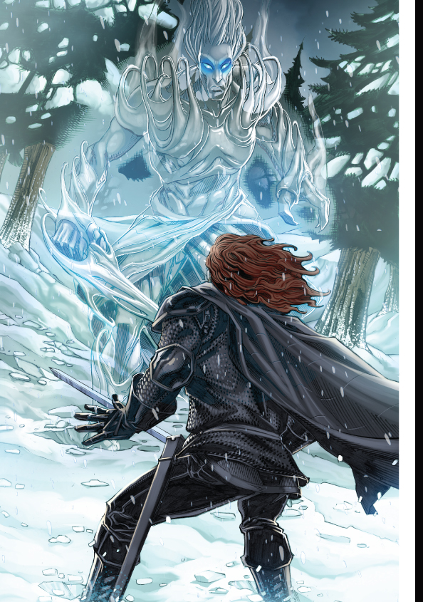
I tried out Izneo’s apps on multiple platforms—a tablet, a smartphone, and even the Nintendo Switch—and what quickly became clear to me is that the tablet offered the best reading experience because of the traditional format of European comics. Unlike manga, which come collected into fairly small books usually somewhere between 144 to 208 pages mostly in black and white, European comics are around 48 to 64 pages, come in much larger dimensions (even bigger than the typical Marvel or DC hardcover collection), and are lovingly detailed in both linework and color. Although each European comic album is relatively short, it can often take a single artist months or even years to complete a single book, and they’re ideally read with the entire page visible to appreciate the overall visual composition. Because of this, it’s a challenge to read on a smaller screen, especially when you hit a word balloon that’s just stuffed with exposition. The best solution might be to just have an extremely large monitor, so you can even read the comics as full double-page spreads all the way, but that’s not a solution available to everyone.

Izneo is well aware of this limitation and offers a couple of workarounds for those using smaller devices. First is their “eazy comics” view, which breaks the page down so you read it one panel at a time. Second is that you can display each page zoomed in so you see about a third of it at a time. Of the two, I much prefer the latter, especially when it comes to older titles that stick more closely to the “three ‘strips’ per page” format. I also want to reiterate that I’m focusing on this issue not because it’s some fatal flaw of Izneo specifically, but because it’s an inherent compromise that comes with digital releases of European comics across all comics services.. The offerings for manga, American comics, and of course webtoons (which are generally created to be read on smaller screens) don’t run into these issues nearly as much. 

In order to do this review, I received the one-month premium subscription from Izneo, but I actually plan on continuing to use Izneo. I haven’t decided if I’ll keep the premium service or go into a la carte purchases, but their digital service just gives me such an opportunity to really explore European comics, and it means supporting the publishers and artists more directly. My only real wish is that they get more titles in the future. I would love to see Yoko Tsuno on there, and for the release to go beyond the few volumes released (out of order) in English previously. If possible, I also hope that they could eventually get non-Franco-Belgian European comics on there, like the Dutch series Agent 327. Overall, when it comes to Izneo, I like what I see, and I want more.

Free Comic Book Day Netherlands 2013

fcbdnl2013-allcomics

May 4, 2013 marked the second anniverary of Free Comic Book Day in the Netherlands. An American institution which I’ve participated in for over a decade now, I was amazed last year to see it brought over to other countries as well.

This year the full selection of free comics was raised from 7 to 10, far less variety than what was offered in the US, but at the same time had many of the charms and stylistic tendencies associated with European comics (even if they may not have been made in Europe!). The comic book store owners I did talk to all seemed to make it a point to tell me that they lose money participating in Free Comic Book Day, and urged me to buy something alongside. In my opinion, this kind of goes against the spirit of Free Comic Book Day in the sense that it isn’t supposed to be a guilt trip, but it might just be a difference in population/costs/other factors which make it not as sustainable as the American FCBD.

Sadly I am mostly illiterate in Dutch so I can’t really talk about the quality of narrative, but I can at least talk about some of the comics which caught my eye, or which most likely would catch yours.

fcbdnl2013-gameofthrones

Probably of greatest interest to people would be the Game of Thrones comic, adapted by Tommy Patterson, and actually available in English. I have not read A Song of Ice and Fire, nor have I seen the HBO Game of Thrones, so in terms of accuracy or spirit I can’t really say anything. At the very least the art is vibrant, and I like it way more than Patterson’s previous work on series like Grimm’s Fairy Tales.

Next is Sienna, by Desberg, Filmore, and Chetville, about a female government agent. “Sexy women of action” as far as I’ve seen is quite a popular genre here, at least in terms of comics made, and this one takes a more mature and dramatic angle. The art is quite nice, and there’s plenty of violence and (I assume) conspiracy. You can see a small preview here.

De Verborgen Geschiedenis (“The Hidden History”) by Pécau, Kordey, and Chuckry stands out immediately just because of the camel on the cover. As far as I can tell (and please correct me if I’m wrong), the comic appears to mainly be about what its title implies: some mix of conspiracy and secrecy spanning decades. Like both Sienna and even Game of Thrones, it goes for a more serious art style. There’s also a prominent English (?) female military officer in this issue whose name I can’t find. With a prominent scar on her face, she  toes the line between sexy and legitimately frightening (more the latter), as her expressions go from cold to menacing throughout the comic. Overall, she comes across as like a female Golgo 13, especially because one scene has her casually waking up surrounded by a pile of naked bodies both male and female.

fcbdnl2013-delegendariers

The last one I want to point is De Legendariërs by Patrick Sobral, due to its overt stylistic influence from anime and manga. Unlike the other three, this one has much more light-hearted feel. Its super-deformed characters and fantasy setting give me the impression of a pre-Playstation Japanese RPG. In fact, the characters look more like a late-80s/90s anime characters instead of current ones anyway, which really harkens back to that era. Anyway, the villain is named “Darkhell.”

So that’s a (very) cursory view of Free Comic Book Day 2013 in the Netherlands. Take my opinions with a grain of salt here, as I can’t give you a true impression of any of them.

And I must ask, for those of you who can read French or Dutch and picked some of these up, which ones impressed you the most?

Of Mice and Spies: Stripfestival Breda 2012

When it comes to comics, the Netherlands is an interesting country. Situated close to Belgium and France, the Dutch have had close ties with that bande dessinée (Franco-Belgian comics) culture, particularly when it comes to the Flemish comics, but they’ve also developed a comics culture all their own. While I’d learned about this a fair deal before, when I went to the Dutch comics festival “Stripfestival Breda” this past month, I was able to see it much more clearly.

Taking place in the city of Breda and spread across different locations near the center of town, Stripfestival Breda is a two-day event to celebrate comics. There, you could buy comics from a variety of venders, get your picture taken with your favorite characters (whether that means cosplay by fans or actual people hired to dress up), and even meet the artists responsible for all of these comics. Each location specialized in a certain area, such as one for events and awards, though I didn’t attend all of them due to time constraints and other inconveniences such as my lack of Dutch fluency. Instead, I primarily looked at the industry area, located in a theater, and the self-published area, located in the city’s Great Church (every Dutch city seems to have one).

The industry locale was the epicenter of the festival, and companies from both inside and outside of the Netherlands were there. They had plenty of books to sell, but what I found to be most impressive is that in a lot of cases, not only were the artists themselves there, but they were offering free sketches. The biggest booth was the Eppo booth, home of a variety of Dutch comics both classic and new (and in some cases the comics have run long enough to be both), which housed about 8-10 artists each with their own lines. With big names in Dutch comics such as Martin Lodewijk of Agent 327, as well as Jorg de Vos and Roman Molenaar, the artists behind Storm (which is available in English), it was a collection of heavy hitters, but amazingly the lines were short enough that I could get multiple sketches in well under an hour.

Martin Lodewijk

In fact, by my estimation, the combined lines between all of the Eppo artists was about as long as a line for Fred Gallagher (Megatokyo) at Otakon. This isn’t to say knock either Fred or the Dutch artists, but just to say that I was amazed by how accessible these artists were.

Interestingly, the most popular comic among young Dutch kids is an Italian series called Geronimo Stilton. I don’t know much about it other than the fact that it features an anthropomorphic journalist mouse who goes on adventures, or whether it’s doing well in the US, but its success was clear as kids line up to take photos with a real Geronimo Stilton, Disneyland-style.

There was definitely a French/Belgian presence as well, though I didn’t spend much time with them, and there were vendors selling a huge variety of comics, including (what I assumed to be) old, hard-to-find items. Many of the vendors sold comics with some erotic content, but there didn’t seem to be any particular separation or shame in it. In some cases they were shrink-wrapped, in some cases they weren’t.

There was some presence for manga and American comics, especially the life-sized Iron Man statue, the anime fan artists who I’ve seen at the Dutch anime cons, and the requisite maid cafe, though they definitely weren’t the main focus. Asking one vendor of superhero comics about the status of American comics in the Netherlands, he told me that The Walking Dead is quite popular.

The independent/alternative comics area was quite a different experience from the hustle and bustle of the industry location, though I think that may have had to do with the fact that it was held in an old-fashioned gothic-style church and featured many art pieces which I might call not very church-like at all. Featured here were many comics which strayed from convention, featuring really erratic character designs and strange subject matter, the artists were not just comics makers but sometimes contemporary art scene artists as well. Items were generally more expensive for the alternative comics than they were for the industry items, but often times not by much.

I spoke to one artist, who told me that his favorite comic was the one that had the sold the least because it wasn’t really to Dutch tastes. Intrigued, I asked him what he meant by Dutch tastes, because I don’t have anywhere near as keen a sense for European comics as I do for American and Japanese, he mentioned that it had to do with round, cartoonish characters with big feet and so on. It’s something I’ll have to do more research on.

In the end, what probably stood out to me most was the fact that gender and age distributions seemed very even. I saw people from five-years-old to fifty-year-sold both male and female lined up at booths, whether it was to buy comics or to meet the artists or their favorite characters, often times for the same series. It made me realize how much comics is a thing for all ages in the Netherlands.

Super-Expressive Faces

I’ve been reading the manga Coppelion lately, about three teenage girls who are genetically engineered to be immune to radiation in a post-nuclear apocalyptic Tokyo. One of those girls is Fukasaku Aoi, whose most prominent feature is that she has an incredibly expressive face compared to the other characters around her. It kind of makes her an endearing character even when she complains (which she does often), and I feel like she can really liven up scenes as a result. She shares this trait with Kurumi Erika from Heartcatch Precure!, and as is evident from previous posts, I like Erika quite a bit as well.

I find myself wondering about the candidness of such characters and why they can be so appealing, particularly when they’re grouped with characters who, while not necessarily reticent, still don’t have quite the range of expressions that someone like Aoi or Erika does. In thinking this through, possibly the best explanation I can find is not from manga or anime but from bande dessinée, Franco-Belgian comics. Though all sorts of things have been written about the expressive nature of eyes in manga, I think I might be best served by The Adventures of Tintin.

At the Belgian Comic Strip Center museum in Brussels, there is a Tintin exhibit which features profiles on all of the major characters. Among them is Haddock, a ship captain and friend of Tintin. Like Erika and Aoi, one of his most distinguishing features is his capacity for making wild facial gestures, and a display in the museum talks about the relationship between Captain Haddock and Tintin, who is usually much more calm in his demeanor. I don’t quite remember everything it said, but it mentioned something about how the visual contrast between the two makes for an ideal scenario where both characters complement each other with their respective approaches and make the comic better as a result.

If that’s the case, then taking that idea and applying it to the three-character structure of Coppelion‘s central cast, I have to ask myself what purpose does that middle character serve, the one who is less expressive than the Haddock but more expressive than the Tintin. My initial thoughts towards this is that the middle character, who in the case of Coppelion is its protagonist Naruse Ibara, is that if you think of the three characters as a spectrum to gauge the direness or excitement of a situation, the point at which Ibara starts to get facial reactions close to par with Aoi’s is when you know things are really getting serious. If it gets to the point where the third girl Taeko is freaking out, then it’s doubly so. Proper use of characters with different capacities for strong facial expressions can potentially control the level of excitement in a comic while also distinguishing the characters for variety.

I get the feeling that much of what I said was pretty obvious, but I still wanted to write it all down.