Tamako Market is Kyoto Animation’s Next Step

In one of my earliest posts I ever wrote for Ogiue Maniax, I talked about my desire for Kyoto Animation to go beyond its own limits, to go from just adapting work to making their own original material. Though my opinion of Kyoto Animation isn’t quite as rosy as it was back in 2007, with their new original anime Tamako Market I actually feel like they’ve finally fulfilled those expectations to a fair degree.

Kyoani is known primarily for two things: really solid animation and cute girls. Together, the resulting product is a soft, delicate quality that is unmistakably Kyoto Animation (and which shows like Kokoro Connect and Sora no Woto have tried to mimic), and it affects different adaptations in different ways. For Haruhi and their Key game adaptations it lent weight and significance to characters’ movements, while in K-On! and Nichijou, two manga with sharp and abrupt humor, it caused the anime versions to slow down in terms of comic timing. In the end, it seems to all come down to the cute girls.

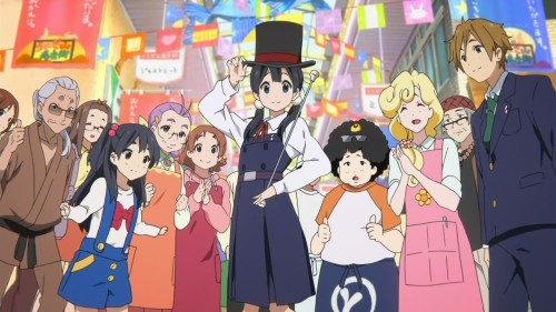
Tamako Market is the first Kyoto Animation show I’ve seen to really let the animators spread their wings. Tamako Market has allowed Kyoani to show personality through movement in a greater variety of character types of all shapes and sizes, from small children to geriatrics, to even a person of ambiguous gender and a silly talking bird. The show then places them in a deliberately slow-paced setting in the form of a small-town shopping area, which makes that Kyoani “slice of life” style feel appropriate. What’s more, even though there are indeed still cute girls in Tamako Market, all of the other characters are portrayed differently from them, giving the viewer not only Kyoani’s bread-and-butter but also something even more substantial.

Given the sheer amount of character variety in Tamako Market, I have to now wonder if it wasn’t just that their old shows didn’t allow them to “push their envelope,” but that having to adapt works limited them due to the contact of the original sources. Most of what Kyoto Animation has adapted has come from dating sims, light novels, which often times are all about cute girls, or manga which center around cute girls. While I think Kyoani isn’t ideal for making certain types of works, it’s clear to me from Tamako Market that their strengths, namely their ability to have characters move with almost a sense of tangible liveliness, go beyond what’s expected of them.

American Mahjong Manga

As a follow-up of sorts to my previous post about American Mahjong, I drew this (read left to right):

First Drawing of Sagimori Arata

Sketch in Celebration of the New Genshiken Anime + More

The Current Genshiken Club Members

The Hokuto Brothers (I think Toki turned out the best)

Yoshimori and Tokine from Kekkaishi

Nonowa etc.

Delicious Rate 300%

Why Nyaruko’s Design Stands Out

I’m not much of a fan of Haiyore! Nyaruko-san, the moe-fied Cthulhu mythos-themed comedy anime, but I find that the main character Nyaruko has a really appealing character design. While she doesn’t look that different from other cute anime girls, Nyaruko draws the eye and leaves a memorable impression to the extent that it makes me want to maybe, just maybe, give her show a second chance. In looking at her more closely, the element that visually differentiates her from other similar character designs, the lynchpin which transformers her into something more distinct and complete, is her checker-patterned dress.

My reasoning has relatively little to do with personal preference (at least as far as I can tell about myself), but is based on the amount of contrast that the checkered pattern provides on Nyaruko’s overall design. Nyaruko does wear other outfits in her series, namely her school uniform, and if you compare the two outfits the checkered dress simply stands out more. There’s the inherent contrast of dark and light that a checkered pattern already has, but there’s also the fact that the pattern stands out against the broad swathes of flat color that make up Nyaruko’s hair, skin, and the rest of her clothing.

You could get a similar effect with stripes, but a checker pattern is like a stripe pattern taken to the next level, and I think that the way the checker pattern is only a small part of her dress instead of the dominant pattern as you might imagine a striped dress to be keeps it from overpowering the rest of Nyaruko’s design. It’s also somewhat of an uncommon clothing pattern among anime characters, which makes it easier to associate the checker pattern with her character before others. What you’re left with then is a visual design which not only pops out but causes others (including other characters in Nyaruko-san) to recede.

The Stylistic Stew of Dragon Who

Manhwa, or Korean comics, are something I am relatively unfamiliar with. I can spot the similarities and obvious influences from manga in modern manhwa, and I’ve looked at a few titles here and there, but I have neither the knowledge of history nor the personal experience to say I have a firm sense of how manhwa “is.” Given that my expertise (if you can call it that) is primarily in manga, however, I found it quite interesting when a manhwa title I’ve read recently, Dragon Who, takes elements clearly inspired by manga but cross-pollinates them in a way which normally never happens among Japanese comics.

A title from 2009, Dragon Who is about a dragon boy named Roa Coatl who travels to South Korea to find the descendant of Quetzacoatl to make her his bride so that they can prevent an impending global disaster. In other words, it’s a shounen-esque school comedy/romance/action title that probably wouldn’t feel too alien to manga readers aside from the decidedly Korean names for most of the characters. Given that comfortable familiarity I think one would expect certain stylistic approaches, and indeed Dragon Who looks the part of a shounen manga to a good degree, but take a look at this image:

(By the way, for those unfamiliar, manhwa reads left to right.)

The character designs look quite shounen, perhaps even closer to late 90s shounen titles, but the use of blooming flowers in the foreground to introduce a character (and this is the main heroine Go So-Ahn’s first appearance) is an element straight out of shoujo. When combined with the fact that So-Ahn herself is designed to be fairly normal as opposed to strikingly beautiful, looking closer to a best friend character than a main character herself, it makes for an almost defiant combination of visual elements: a shounen title with a shoujo-esque heroine with shounen heroine looks.

Not only that, but Dragon Who has its own fair share of attractive guys, and while the title is neither harem nor reverse harem, the following image can give a certain impression as to how the title skews.

At this point, I think it would be easy to chalk it up to the popularity of shounen titles among female reader inside and outside of Japan (and I would have to assume Korea as well), and the titles which are designed to appeal to girls in Japanese comics to varying degrees such as Black Butler and Kuroko’s Basketball, but I’m not so sure that explains it. For one thing, Dragon Who is still keen to include elements like beefy muscular guys who aren’t all lithe bishounen, as well as fanservice for male readers.

Just to be clear, this is not a matter of manhwa looking “enough” like manga or not, but rather seeing how the manhwa inspired by manga doesn’t have to play by the rules (or at least plays with chunks of rules from four different places). To me, it feels more like Dragon Who is the product of authors taking aspects and visual language from manga regardless of genre or intended audience and putting them all in one place, or like if a shoujo writer were paired with a shounen artist. It’s a crossing of assumed boundaries which can show how thin and permeable those walls can be if only we’d allow them to be.

How Kio Shimoku Got His Groove Back

Genshiken II‘s been running for a while now, and every so often I go back and look at the earlier chapters of the new series (would you expect me to do otherwise?). Upon a recent revisit, it hit me just how much the artwork had changed between the inaugural Chapter 56 and its immediate followup in Chapter 57.

For comparison, here is Ogiue in Chapter 56 on the left, and 57 on the right.

There’s a clear difference between the two versions of Ogiue (or any other character) that can’t be chalked up simply to the gradual evolution of art style that happened throughout the original Genshiken. This change, given just how drastic it is, was more abrupt, though one has to keep in mind that the real life gap between 56 and 57 was almost a year (Chapter 56 was originally a one-shot that got turned into the start of a new series).

Because of how much softer and more cutesy Chapter 56 Ogiue is portrayed, my suspicion is that Kio’s style was affected by his time working on Jigopuri. Indeed, Chapter 56 of Genshiken actually came out in the middle of his run on Jigopuri.

In fact, if you look at one of the characters in Jigopuri, the little sister Kaname (pictured left), she looks pretty close to the Ogiue of Chapter 56. What’s also kind of funny is the fact that Volume 1 of Jigopuri features an Ogiue cameo on the inside cover, and it’s clear that the Jigopuri style hadn’t fully taken over Kio’s artwork yet at the time he drew it.

I think it’s interesting how an artist can get so influenced by how they’ve been drawing that it makes it difficult to shift gears back to a different kind of story. It’s different depending on the artist of course, but I have to wonder how much effort Kio put into switching into a less moe-type art style. Something tells me it wasn’t easy.

Sexualization Without Objectification in Spotted Flower

When it comes to debates regarding how women are portrayed in media and entertainment, one recurring trend is the way that sexualization gets conflated with objectification. Whether it’s comics or not, Japanese or not, often times the two are presented as one, so it’s no surprise that there are readers who see them as one and the same and argue from a stance that reducing or removing certain depictions of women means a puritan-like removal of sexuality itself from media. While I don’t have the same problems with objectification that others might, it’s still an issue because this misunderstanding begets many other misunderstandings. It’s for this reason that I’m impressed by how the manga Spotted Flower handles the female body, and I think it gives a very clear case of how it is possible to draw sexual characters who aren’t necessarily sex objects.

A manga by Genshiken author Kio Shimoku, Spotted Flower is about an otaku husband and his pregnant non-otaku wife, and the small challenges they face as their lives enter a new stage. With a title referencing Madarame and Saki from Genshiken (Madara refers to spots—take note Naruto fans—and Saki means “bloom”) but clearly pointing out that the characters are not them, much of the manga revolves around how being an otaku can influence the relationship in certain ways. The other prominent theme, and the one I’m more concerned with for this post, is that of the pregnant wife’s sexual frustration. The problem the wife faces is that even through pregnancy she still wants sex and wants it badly, but it’s difficult for the husband to overcome the misconception that pregnant women are entirely different from sexual women (despite the act that it takes to get them that way). This makes sense, as depictions of pregnancy tend to focus on their motherly qualities and ignore the woman’s sexuality.

Spotted Flower does not draw that line in the sand. Much like his work on Jigopuri (about raising an infant), Kio doesn’t play it safe. He draws nudity. He draws bare breasts. He doesn’t shy away from showing sex and the desire for sex as very physical, mental, and emotional, but at the same time also doesn’t reduce pregnancy into a simplistic fetish or kink that you would find in some adult manga. He expresses the wife’s frustration in such a way that, even if she does not have the ideal body or the easy appeal of the “virgin” or the “nympho,” there is a kind of sexual attractiveness to her, an undeniable sensuality radiating from her which has little to do with the woman as object of desire and more as a person who desires.

As is obvious at this point, Spotted Flower is rather unusual in a number of ways, but it is also a series of possibilities and potentials. It pushes boundaries which probably shouldn’t be boundaries in the first place, and does so with a strong sense of characterization fans of Kio Shimoku have come to appreciate.

Perceptions of Perfection in Say “I Love You”

I’ve been watching Say “I Love You” (aka Sukitte Ii na yo), and it’s a really good romance series that I would almost describe as a mix of Kimi ni Todoke and Boku wa Tomodachi ga Sukunai in the way it has the unlikely relationship and the awkward personalities. Granted, that description might also apply to the other shoujo romance this season, Tonari no Kaibutsu-kun (My Little Monster), but where Kaibutsu-kun has more of the humor, Say “I Love You” I feel really delves into issues of self-image.

In episodes 3 and 4, we’re introduced to a character named Mutou Aiko, who is thin and beautiful, but what we learn over the course of these two episodes is that such seeming perfection comes with a price. In her case it’s serious scars on her body as a result of extreme crash dieting, prominent streaks along her stomach that you can’t even begin to describe as “stretch marks.” The scars really caught my attention that episode because of how they contrast with her outer image of absolute beauty, especially when you take into account that shoujo characters and even anime characters in general tend to have “ideal” skin. Or, to put it more accurately, because anime and manga tend to consist of simpler colors and shading, even small changes to characters’ appearances come across much more prominently; drawing a single line for a wrinkle pretty much means that wrinkle looks deep no matter what.

By having those dieting scars and having them visible to the viewer, even Aiko’s anime-esque perfection feels different because one can see the amount of effort put into it, that it didn’t just happen by default. By feeling “manufactured” in this sense, it also ends up feeling more realistic, that this is not her natural beauty but something she has to constantly work at. Perhaps more importantly, it also says a lot about her character that she thinks the scars on her naked body were worth the appearance she gives to the rest of the world.