Doctor Who Anime Fan-Trailer: Good Skills, But…

Translator Paul “Otaking” Johnson, probably most famous on the internet for his criticism of fansubbers (not the illegal part but that they draw too much attention to themselves) and his particular views on how anime should look (five-tone shading), recently released a finished preview of his Doctor Who anime treatment. Taking the iconic British science fiction hero and putting him in Japan, the whole thing lasts 12 minutes. While Johnson has since taken the Doctor Who video down, I still want to give my impression of it, and you can still find previous versions around.

I’ve been critical of Johnson in the past over his adherence to “five-tone shading.”  There was never anything inherently wrong with the concept of “five-tone shading,” and my criticisms were primarily that there are a variety of ways for anime to look good, that budget inevitably plays a factor, and that if you disregard all shows that don’t use that shading style, you look down on not just current anime but also anime from before the 1980s. But it being a few years and all, I had to wonder what he’d learned since then.

Now I am not a fan of Doctor Who as much as I have never actually watched it, so I cannot judge this preview animation based on how well it captures the Doctor Who spirit. Anything I know about it is from reading the internet. I also understand that it’s more a proof of concept, not a trailer or anything that requires a storyline, so I won’t say anything about plot coherency. Having done a bit of animation in the past myself, I can tell that Johnson has talent and put a lot of work into this project.

But it still doesn’t look good, and while that doesn’t preclude an animation project from being all right overall, it is a problem for Johnson who prides himself on understanding what makes anime look good, especially because the preview is meant to be a visual showcase.

There are certainly elements of it which look impressive, bits and pieces that stand out and grab your attention, but taken as a whole, it is less than the sum of its parts. I do not mean that the characters sometimes look off or that the animation goes sour at times, because that sort of thing happens. The real issue stems not from a lack of technical skill or any minor flubs, but from an inherent flaw in Johnson’s aesthetic philosophy.

Five-tone shading is not the entirety of the problematic philosophy, but its effects are very clear in the work itself and so a good place to start. Again, there is nothing wrong with thinking five-tone animation looks better, but just about very single character and object in the animation has this in spades, to the point that it becomes overwhelming. Everything is so specifically made to have that elaborate shading scheme that it is difficult to look at. Characters are frequently as prominent as their surroundings, the foreground is often times difficult to differentiate from the background, and it just ends up as a garish mess. It’s just too much. There are plenty of anime out there which use that shading method, but they don’t overwork it into every single thing all the time to the degree that everyone and everything fights for your attention.

Another problem is that when you’re animating with five-tone shading constantly, it becomes difficult to maintain the shadows while in motion. One need only look at the original, pre-release animation from Super Street Fighter II Turbo: HD Remix to see this problem. They originally went for a similar shading style there, but it causes shadows to be inconsistent and to “pop” unnaturally unless a lot of care is taken. There are limitations to five-tone shading, among then simply time and manpower. When five-tone shading is used as an absolute rule, those limitations become even more apparent.

It’s not just shading which can create this problem, but also character design, which is why a show like Turn A Gundam has relatively simplistic ones. This is also another area where the Doctor Who anime preview runs into problems, because much like with the shading, the character designs have too many aesthetic bells and whistles as the result of a particular desire for 80s anime-level “intensity.” All of the characters look dated as a result.

I can potentially see why someone would think that I’m criticizing 80s/90s character designs as a whole for not being “new” enough, I should clarify my point. Everyone, with possibly the exception of the Doctor himself, looks like they were inspired by a 1980s version of a “How to Draw Anime” book in the sense that the characters all look like they were made with the idea that this is how anime characters are supposed to look, down to the hairstyles and the little details. This is most prominent with the character of “The Master,” whose eyes make him look like a 17 year old wearing a fake beard. Certainly there are actual anime out there which are also guilty of this, but it’s still something to be aware of.

I could touch on more aspects, but I’m not trying to nitpick little flaws as much as I’m using them as examples of how the basic approach to this project has problems. Again, the whole project is impressively made, but the overall flaw with Johnson’s animation style is that he sticks too closely to his beliefs about how anime “should” look. Because the aesthetic philosophy upon which that’s founded is underdeveloped and incomplete, it results in a work where certain elements, such as shading detail and particular character traits, have been rendered extensively but at the expense of fundamental aspects like visual clarity and not forcing characters into overt visual tropes just because that’s how things were done. There is nothing inherently wrong with the desire for elaborate visuals in everything, but it alone cannot act as a visual foundation.

Sonya Blade is an Awful Character

With the recent release of Mortal Kombat 9, a lot of beloved figures in the Mortal Kombat franchise have been re-designed to look both modern and reminiscent of their very 90s character designs in an effort to bring the series back to its old school roots. Remembering that Sonya Blade’s design was absolutely awful in the previous game, Mortal Kombat vs. DC Universe, sporting the most ridiculous shirt ever, I wondered how they would portray her in this iteration. While the new design is an improvement, it makes me realize that Sonya is actually just a terribly-designed character.

Here is Sonya throughout her 3-D fighting game history, away from the live actor portrayals that characterized Mortal Kombats 1 through 3. If you did not tell me that they were all supposed to be the same character, I simply would not be able to tell. Nothing is consistent about her, short of the fact that she’s blonde, has big tits, and shows an exposed midriff. Sonya Blade is a terrible design because she is a non-design.

While she could be criticized for having an over-sized, unrealistic chest and ridiculously skimpy outfits, that’s not really the point here, as the scantily clad and jiggling girls of Dead or Alive share those properties in spades and yet are still distinctive even when they’re wearing 1 cm-thick bikinis and taken out of a relative comparison with each other. Nor is the problem that her design is too generic, as the Virtua Fighter series is all about cookie-cutter characters, and yet whether it’s the blocky and outdated graphics of Virtua Fighter 1 or the more recent Virtua Fighter 5, Sarah Bryant, a fellow fighting blonde, is still recognizable. Chun-Li can appear in Street Fighter Alpha younger and sporting a different outfit and still look like Chun-Li, and she also successfully made the transition to 3-D with her very iconic look and style.

On a broader scale, video game characters rely on a certain degree of iconic visualization, and though this is more easily done with a mascot like Mario or Sonic, it’s still possible with a more realistic figure. Sub-Zero and Scorpion show this, despite the fact that they both started out literally as the same character design with different colors. it’s clear that Sonya simply never had anything beyond her rack and her belly button to distinguish her. Back in Mortal Kombat 1, when she was the only female character, this arguably could have been sufficient, but as more and more girls have appeared in the franchise over time, also with large breasts and bare midsections, it really makes it obvious that she wasn’t thought through thoroughly.

For a further comparison, take a look at this image Sophitia Alexandra from the Soul Calibur series which I conveniently obtained from elsewhere. Although her design has gone off the deep-end in recent games, it’s very clear that all of the above figures are supposed to be the same person, even when drawn by different artists. If I were to make an educated guess as to what makes Sophitia work but not Sonya, I’d say that it has to do with the fact that Sophitia was designed in the first place with certain key visual elements like her sword and shield, skirt, and gentle demeanor, and even when next to her somewhat similar sister Cassandra, you can still tell the two apart by how their designs convey their personalities. It can be as simple as that, so that when they’re given makeovers in later games, a person can take one look without being told specifically who it is and say, “Aha, that’s her! …She looks terrible!”

Japan: Opportunities to Give and Consider

A number of sites have cropped up in the wake of the 8.9~9.0 magnitude earthquake that hit Japan last Friday and the ensuing tsunami and nuclear scare with the purpose of uniting anime fans to donate to Japan. Certainly a noble cause, but one that I have honestly not felt entirely comfortable with, just because I don’t want it to be “about” being an anime fan.

I have benefited greatly from anime and manga. It has been a great source of entertainment, comfort, self-realization, and even one of the reasons I currently have an unbelievably wonderful job. I studied in Japan because of a love of animation, and I continue to make friends in Japan because of that passion. But before I could donate as an anime fan or an anime blogger, I had to do so as a human being.

However, I realized that it’s not my place to tell people “why” they should donate, or even if they should be donating at all. I have my reasons for acting as I have, and I know that the folks running these donation drives have the best intentions at heart. The more opportunities the better, and I can at least provide people with links to donate, whether you want to do it as an anime fan, an anime blogger, or just a person who wants to help.

Anime Fans Give Back to Japan: They’re doing a 24-hour podcast tomorrow, March 19th, starting at 6pm EST. They have a number of fans, podcasters, and even industry professionals lined up to show their support.

Crunchyroll Japan Earthquake Donation Fund: The biggest streaming site for anime promises to match donations.

Anime and Manga Bloggers for Japan: They’ve got two donations going, one for Shelter Box, and one for Doctors Without Borders, a self-explanatory group that I first came to know due to their distribution of Plumpy Nut to combat malnutrition in Africa. That’s not exactly the problem here, but I think it says a lot about their mission.

Japan Society: 100% of donations go straight to helping Japan.

Red Cross

UNICEF

Lastly, a lot of artists have been creating work in response to the earthquake, and as much as I have neglected that side of myself, I felt my hand moving on its own when put in front of a piece of lined paper and given a writing tool to work with. It’s not exactly a clear-cut “Pray for Japan” image, but it definitely comes from the heart.

The Cross-Cultural Exchange of a Couple of G’s

In 1996, Russian-American animator Genndy Tartakovsky premiered Dexter’s Laboratory and pioneered the thick-lined,”flatter” animation style. This style can also be seen in Samurai Jack and Star Wars: Clone Wars, as well as in Powerpuff Girls, where Genndy was director.

Flash back a few month to 1995 and we get one of most the influential anime ever, Studio Gainax’s Neon Genesis Evangelion. Gainax, known for a variety of works from various genres, are especially fondly remembered for their giant robot fare, most notably Evangelion but also Aim for the Top! and Tengen Toppa Gurren-Lagann.

Now, in late 2010: Gainax’s latest anime is a tongue-in-cheek cartoon about a pair of misfits and heavily utilizes thick outlines and very flat character designs, while Genndy Tartakovsky’s newest show is an honest, non-parody attempt at a super robot-themed series. Both series’ debuts occurred less than three weeks apart from each other.

While the relationship between Japan and America’s cartoons and comics have been put in the spotlight recently with collaborations such as the joint Iron Man and Wolverine projects involving Marvel and Studio Madhouse, the fact that Genndy Tartakovsky’s Sym-Bionic Titan and Gainax’s Panty & Stocking with Garterbelt have come into existence so close to one another puts an even greater focus on the two nations’ cartoons. Here in one cross-section of time, we can see the active/passive exchange of ideas as these cultures’ animation styles appear to intertwine so tightly that they sling each other across the Pacific Ocean.

Neither show is so like the animated series of the others’ country that they come off as weak imitations. Sym-Bionic Titan takes fusing robots, a fight against a powerful invading force, and various other giant robot tropes, mixes them in with Genndy’s own character aesthetics, and places the story firmly within America and its own cultural norms. Meanwhile, Panty & Stocking utilizes the visual elements and humor of early “Cartoon Cartoons” (as Cartoon Network referred to them) while also injecting very anime-esque expressions and reactions from its characters, most notably in their faces, and also ramping up the humor to more “adult” levels. The two series and their hybrid styles reinforce both the idea that creativity is not limited by national borders and that individual cultures can still maintain some of their distinctiveness when it comes to artistic output.

This is not a bad thing.

As a final aside, the personal robot used by the character Lance in Sym-Bionic Titan reminds me of the titular robot from Galaxy Gale Baxinger.

I can’t be the only one, right?

Manga Artists and Their Stylistic Progression: A Video Demonstration

A while ago, I found a series of videos on Nico Nico Douga wherein manga characters from the first volume of their respective titles are compared to their later incarnations in the same series. In most instances, this is done to show some kind of great contrast, either by a marked improvement in drawing ability or an unusually large shift in style. I think it’d be to everyone’s benefit to take a look, and because I understand that not everyone has a Nico account or wants to fumble with the Japanese language registration, I’ve taken the liberty of uploading all three videos to Youtube. You can find them at the bottom of this post.

Regardless of how exactly the change comes about, the shift or transformation in art style seems to most often come from increasing familiarity. Speaking somewhat from personal experience, when you first start to draw a character, even if you’ve planned them out extensively, there’s still a period of struggle where the character’s design and by extension their personality and physical language are not yet ingrained in your psyche. The more you draw the characters, the more natural they feel to you, possibly eventually reaching a point where you’re so comfortable with them that your aesthetic sense and personality start to shine through the characters, almost subconsciously. It’s like your body and mind start to prioritize what’s really important to you, and I think you will definitely see this happening for at least a good number of your favorite artists.

So take a look, be amazed, and lay down your own thoughts and feelings about art in manga. If you’d all prefer, I can even compile a list of all of the artists and titles mentioned here.

A Common Misunderstanding

Nandoga Nare: Let’s Get Ready for Otakon 2010

Otakon is this weekend, and I am psyched. Not only that, but if you didn’t know before, I’m doing two panels this year. You’ll find both of them on the Otakon Schedule, but just to make sure, I’ll highlight them below.

Riichi: Japanese Mahjong, Anime, and You
Time: Friday, July 30 at 9:30am
Location: Panel 4
(Hilton Key 11-12)

If you’ve watched such popular anime as Akagi and Saki, you’ve been witness to the ancient game of mahjong– and you had no clue what the players were doing. Maybe you’ve even tried the game and found the complicated rules too intimidating. We did too! But we managed, and today we’re here to show you that it can be done. Let us enlighten you on the basics of Japanese style, or “riichi” mahjong, its appearances in anime and the entire genre of manga devoted to it, and how to play this fascinating game!

Portrait of a Fujoshi: The Psychology of Ogiue Chika
Time: Friday, July 30 at 11:00pm
Location: Panel 4 (
Hilton Key 11-12)

Throughout the series “Genshiken,” the character of Ogiue Chika goes on a journey of development, tackling topics such as self-image, childhood trauma, and the many perils of being an otaku-in-denial. Come, if you want to really delve into the mind of Genshiken’s most psychologically complex character with a panel brought to you by the experts on angry fujoshi characters, Ogiue Maniax and Viga the Otagal!

Now I understand that the first panel is very early and the second panel is very late, but I think you’ll get a kick out of both, particularly if you are a fan of both Ogiue and mahjong (I’m sure there’s a lot of you out there).

I’ll also be running around with the above image around my neck. It’s a special badge for this year that I’ve put quite a bit of thought into. You might even be wondering, “Are those a random assortment of tiles below Ogiue to reference the mahjong side of things?” But they’re not.

The hand is a Hon Itsu, or Half Flush, signifying Ogiue’s self-image of “impurity.” It also contains bamboo tiles, as the Ogi in Ogiue means “reed,” with the added benefit of the 7 of bamboo resembling Ogiue’s paintbrush hairstyle. They’re all odd numbers because Ogiue herself is odd, and the east and north tiles are in reference to the fact that Ogiue is from “Tohoku,” the northeast region of Japan. Finally, the hand is also a Chii Toitsu, or Seven Pairs, because Ogiue is a fujoshi who likes to come up with pairings.

See you in Baltimore!

Sho Nuff Himself Would Be Scared

When I think of western anime fanart, the first thing that pops into my mind is something I call the “Deviantart style.” Characters are usually drawn fairly realistically, their bodies becoming canvases for a psuedo-airbrushed look, every shadow and every highlight blended so softly that characters can probably be best described as “glowing.”


Artist: Yanimator

Artist: Ramy


Artist: REIQ (NSFW)

Now I am fully aware that Deviantart is home to an incredible variety of artists, and that even among the anime-style artists this is not anywhere close to the sole artistic style present. Nor am I even saying that this style is bad. However, as far as I can tell, this glowing style tends to be the most popular and ubiquitous, especially at anime conventions.

So my questions are: Why is this style so popular, and how did people learn it?

When I look at the most popular manga artists, none of them actually color their images in this manner, not Kishimoto (Naruto) nor Kubo (Bleach), and especially not Oda (One Piece). Branching out, I can only think of a handful of artists who get anywhere close to that Deviantart style, and most of them cut their teeth in the world of adult doujinshi, such as Satou (High School of the Dead), so their styles end up being closer to visual novel CG than anything else.


Artist: Satou Shouji (aka Inazuma)

One major difference is that the aforementioned Shounen Jump artists all color using real tools, and when I think about it, the Deviantart style seems born out of an almost purely digital environment, where textures can be finely tuned to almost microscopic levels, and stroke lines can be edited down with the utmost precision. It is, perhaps, a style resulting from the ability to hit ctrl-z in Photoshop and Illustrator. Of course, I’m not saying that it’s an impossible thing to overcome, but that perhaps artists who have experience with traditional media may be better at transcending limitations and making that style their own.

When it comes to anime artwork among western fans, I feel like there is an obsession with “realism.” In OEL manga for instance, a great amount of attention is put on screentones for smooth shading and for perspective in building backgrounds. With fan artists, perhaps this manifests itself into a hyper-realism where vibrant gradients rule the land. Not to pick on him again or anything, but it feels like the “five-tone shading” concept taken to the extreme, where the number of tones approaches infinity and the whole thing turns into a calculus metaphor. In a way, it reminds me of superhero comics, where musculature is emphasized greatly because they similarly harken to reality through exaggeration.

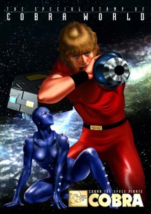
The closest artist I can think of which combines all of these elements is probably Terasawa (Space Adventure Cobra), but I get the impression that not very many artists on Deviantart take their inspiration from Terasawa.

Artist: Terasawa Buichi

But this is all speculation on my part. What do you think of the Deviantart style? Like it? Hate it? Do you use it? If so, what are you influences?

I just want to figure out how it came to be.

Remember the Good Times

Random Robot Doodles