Kio drew his first original 18+ doujinshi, called It’s All Your Fault, Sensei, which is now available on FANZA and DLSite under the circle name ぼたん堂. Content note: It is futanari on cis girl, and in terms of depictions of sex goes well beyond anything shown in Spotted Flower.
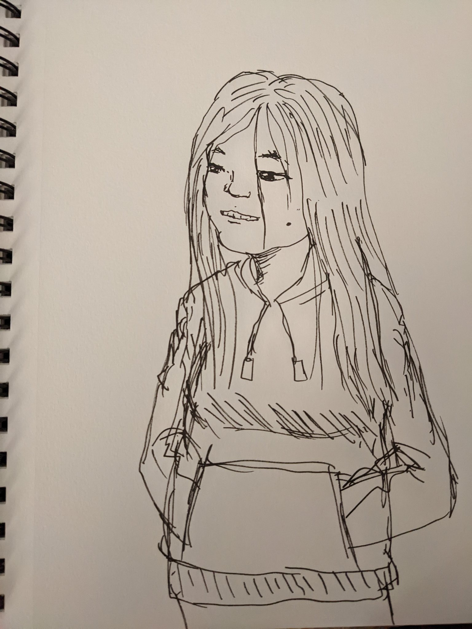
Those who have been following Kio’s Twitter account might recognize one of the girls, as he drew an earlier version of her around the New Years in a bunny outfit.
Kio mentions that had he wanted to draw what happens between Sasahara and Ogiue on the couch, it would have been “something similar,” though the original tweet has been deleted, so it’s not clear if he’s referring to his doujinshi or the fact that Not-Sasahara and Not-Ogiue are in bed together in the side chapters.
A doujinshi cover of Ritsuko from Genshiken Volume 1.
From Genshiken Volume 4, reviews of different routes in the Kujibiki Unbalance visual novel. Madarame reviewed Renko’s, Sasahara Ritsuko’s, Tanaka Izumi’s, Kugayama Kasumi’s. Kio agrees with a commenter that Ootani Ikue (voice of Pikachu) fit the character perfectly.
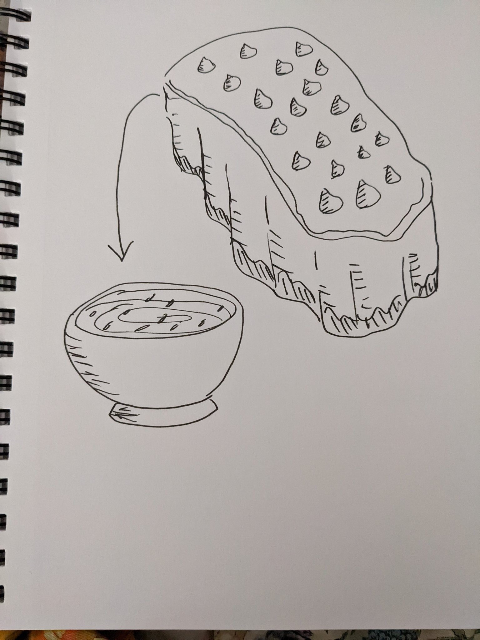
According to Kio, drawing ero manga is sort of the opposite of regular manga, and that’s what made it tough for him when planning it. In regular stuff, his thought process is paneling -> text -> art, but for pornographic stuff it’s art -> text -> paneling.
March has been a big month for Kio, as Spotted Flower Volume 6 just came out today, the 31st! Not only that, but he’s been posting lots of high-quality art from the original Genshiken run, particularly about Kujibiki Unbalance.
Front and back covers of Spotted Flower Volume 6. Like all volumes, the underjacket cover features the characters in their underwear, and you can just barely see it peeking through.
Clean version of the title page image for Genshiken Volume 3.
A commenter talks about how the line “You have a nose hair sticking out” comes to mind. Kio replies that such a line would be in a Saki route, and it would lead straight to a Bad Ending.
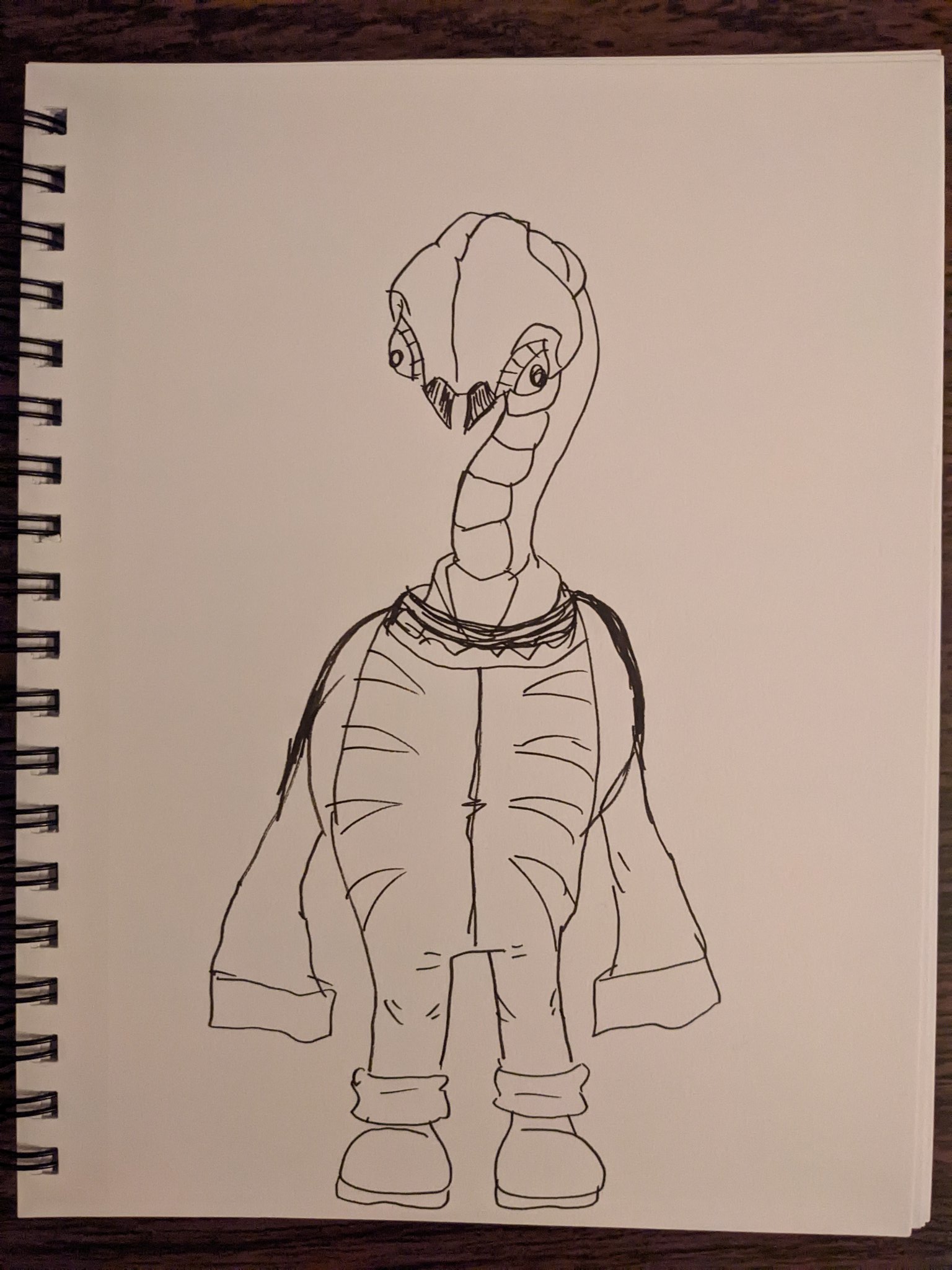
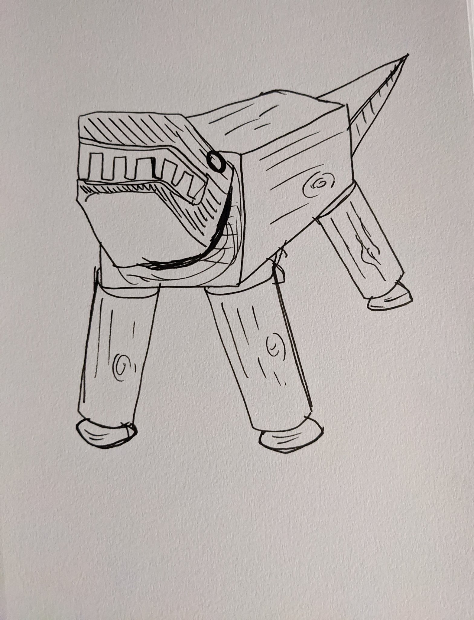
A model kit of the Knight of Gold (K.O.G.) from The Five Star Stories that Kio built. When asked if the kit is lacking a Buster Launcher (a standard weapon in that universe), Kio replies that there actually aren’t many design specs for the K.O.G., and modelers had to use their imagination to make these kits. Likely, the K.O.G. doesn’t have a Buster Launcher because it would need a counterweight to balance it.
Genshiken Volume 3 extras: Artwork from Unbalance Fighter, a fictional Kujibiki Unbalance doujin fighting game. Kio notes that while Berserk Tokino is based on Berserk (Orochi) Iori from King of Fighters, all her attack names are based on NECO from the game Zero Divide.
The strategies as they’re written in the volume are inspired by the guides from the magazine Gamest.
Starting from here are “screenshots” from Unbalance Fighter. Here is Renko and Yamada vs. President (Ritsuko). Supposedly this isn’t an unblockable, but it is an incredibly strict high-low mixup.
President vs. Shinobu-sensei. Ritsuko’s fighting style isn’t based on a fighting game character, but rather Jhons Lee from Air Master. Kio is an Air Master fan.
Renko and Yamada vs. Lisa. This is an animation frame from Lisa’s “Coin Toss” attack. A commenter mentions that they used to play a lot of fighting games (like KoF ‘94) but not anymore. Seeing the fine details of Kio’s explanations takes him back, though. Kio responds that the depth of the characters is based on SNK, and that he owned a NEO-GEO. However, the animation impact is Capcom-esque.
Lisa’s super being performed on Kasumi. As mentioned in Volume 3, Kasumi loses a lot of her abilities if she gets grabbed as a way to be lore-accurate at the expense of game balance (Kasumi basically faints if she gets hugged).
A commenter replies that in the modern era, broken stuff in fighting games gets patched, and this probably wouldn’t last. Kio replies that because Unbalance Fighter is a doujin game, it might have gotten a patch at some point.
The title page image for Genshiken Chapter 18, which was later turned into a jigsaw puzzle. Kio tried to fill it with as much stuff as possible to make it good for a puzzle, but he feels like the results were iffy. One fan shows their completed puzzle, and as noted by another, it originally came in the Nov 2003 issue of Monthly Afternoon.
A fan recalls that the figure version of Ohno on the TV from Volume 3 was from a Wonder Festival. Kio replies that he has the entire series stored somewhere.
Kio is starting to build another kit: the Demi Trainer from Gundam: The Witch from Mercury. It has three sets of runners and no polycaps. He’s also resisting the urge to start filing things down right away.
Kio’s progress on the Demi Trainer. His comments are basically marveling at the quality and advancements of current Gundam model kits, including the lack of need for polycaps (which used to be the standard for kits in the old days).
“Sprites” and “backgrounds” for Unbalance Fighter. Someone in the replies comments that all this fine and detailed work shows how much love Kio put into it, and they’re glad to know that he had fun drawing it. Kio responds that “youth” was also a big factor.
Spotted Flower Volume 6 will have exclusive illustration cards at six different stores in Japan. (For the record, I plan on getting the one at Toranoana).
The illustration from the cover of Genshiken Volume 4. Someone in the replies says that her wearing a mask feels like this picture is happening in real time, and Kio says he has the same thought.
In response to a hashtag prompt, artist and character designer Kotobuki Tsukasa shows a drawing of his from 30 years ago: a manga titled Go Go! Our Marbet-san, from his Victory Gundam short story parody series. Kio mentions having this book all this time.
This month’s Kio Shimoku tweets are a real treat, as he’s been posting a bunch of old Genshiken art without any text, including at least one piece that’s never been released widely see above)! Genshiken was also trending on Japanese Twitter thanks to being spotlighted on a TV show!
On Duck King’s birthday, Kio mentions that he used to play Duck King. He could do Duck King’s command throws from jumping or out of a block, but never from standing.
In response to a Kim Kaphwan player, Kio refers to Kim as a “demon.” Another commenter replies with “Obenjo Baby!” (Toilet Baby)—a mishearing of one of Kim’s attacks. Kio jokingly says he never could figure out what Kim was saying, so he’ll accept this interpretation
Kio bought a Playstation 5 and Elden Ring despite a lack of free time. He also wants to try SEKIRO.
A long-time fan asks him to please not die without releasing any new works because he was playing nothing but Elden Ring. Kio says he’ll be careful. (Others in the thread do not mind encouraging him to play more.)
Kio accidentally misplaced some parts for a model kit. Manga artist Ikuhana Niiro and Kio talk about how this sort of thing makes them grateful for the quality of Gundam kits.
Kio showing the parts he’s built. When asked if this is a garage kit, he says that it’s technically an action figure kit Kaiyodo used to sell, but it’s functionally a garage kit.
Kio built one of the kits from the box in this older tweet: Knight of Gold from The Five Star Stories. It turns out one of the parts that went missing earlier is actually for this.
Kio learns that Genshiken is going to be on the TV show Sukkiri the next week, on the segment “Hot Comic.” He’s excited about this, and naturally receives a bunch of congratulations from fans (too many to list in this post).
I will make an exception for this one person who says they love Ogiue and Sue. Kio responds “OgiSue! ……Or Sue/Ogi?”
Kio has been so busy with Spotted Flower and other things since the end of last year that he hasn’t had time to work on his ero manga project. Even though it’s the same amount of work that he had when doing a monthly series, it somehow feels unsustainable these days.
Kio posts this old drawing of Madarame and Jin, to which someone responds that they wish they could see both Genshiken and Hashikko Ensemble continue. Kio thanks them, and says he’ll continue to work hard on Spotted Flower.
Another older drawing, but this time someone shows Kio that they have the hot-spring bathing Ohno bust that came free with an issue of Monthly Afternoon. Kio calls it a fine product.
An Ohno fan says they loved Ohno so much, they ended up with a girl like her, and that Kio is responsible for this “severe” crime. Kio jokingly says that’s unforgivable.
A fan mentions that he used to be embarrassed to say the word eroge before Genshiken. Kio replies that they actually checked if there was any issue using it for the anime, and the response was “none at all.”
Kio finished watching Sukkiri. He jokingly equates hearing all the old lines he wrote 20 years ago to humiliation fetish play, and says he’s happy to see it regarded as a story not merely about otaku but about human beings.
Kio feels the depiction of otaku in media has changed since then.
Director Mizuhima Tsutomu (Girls und Panzer, Shirobako) mentions working as staff on the first Genshiken anime and the Kujibiki Unbalance stuff in there. He also worked on the Kujibiki Unbalance light novel as part of the group called “Yokote Michiko and Her Pleasant Companions.” (Yokote Michiko is a writer who’s worked on Genshiken.)
Singer Atsumi Saori talks about how if it weren’t for Genshiken, she wouldn’t have wrote the ending theme for it, “Biidama.” She’s grateful to the series for that reason.
Kio thanks her back, and talks about how he likes the fact that the song contains both happiness and sadness.
Manga creator Shikizawa Kaya describes Genshiken as if actual real people were chiseled and dug out for it. Spotted Flower uses an even sharper chisel, and results in something very thrilling. Kio responds with gratitude.
A fan didn’t realize that the name Genshiken Nidaime is in part a reference to the second club president. I.e. Madarame. Kio responds that this was one thing he considered when naming the series.
A Japanese model, Ikeda Miyuki (aka Michopa-san) said something along the lines of it being weird to experience works from an era before the concept of otaku had proliferated in the culture. Kio agrees.
Kio thanks the host of “Hot Comic” on Sukkiri, actor Okayama Amane, as well as the staff for talking about Genshiken.
He then promotes Spotted Flower by calling it “What-if after-story, or maybe a spin-off, or maybe a parallel world—even the author isn’t sure.” He then shows the above drawing of Not-Sue and Not-Ogi and says “Characters like these show up.”
The cover of Genshiken Volume 8. Also, it turns out that my Twitter mutual and fellow Ogiue fan Noori actually went to the spot referenced in the cover! Kio thinks that’s probably the place?
Kio responds with a “Nice!” to someone telling him that they grew up wanting a senpai like Madarame, and eventually found one after they started working.
Ritsuko from Kujibiki Unbalance in a school swimsuit, from the back cover of Genshiken Volume 2. When shown a sealed figure of the same character, Kio points out that the figure in question is based on an illustration by Yagumo Kengou (who illustrated the light novels, and was later in charge of the designs for the anime).
A commenter mentions to Kio that the Midnight Blissed version of Hydron (Nool) from Capcom Fighting Evolution is clearly based on Ritsuko from Kujibiki Unbalance, and not only does Kio know that, but the artist who made those drawings has also made a Ritsuko doujinshi.
Title image from Genshiken Chapter 9. Kio notices that the colors seem different on Twitter compared to how they actually are, and one commenter replies that it might be because they need to be converted from CMYK to RGB for viewing on screens. Kio realizes this is the case and proceeds to repost many of the earlier illustrations.
Kio bought a plastic model of Super Sasadango Machine, a wrestler from the comedy wrestling company DDT. He’s a parody of Super Strong Machine from New Japan Pro-Wrestling.
Kio explaining about how the first anime had a special addition with the Kujibiki Unbalance OVAs, and this is what led to Director Mizushima helming the TV series.
The cover art of Genshiken Volume 3. Kio also replies to a commenter talking about how he thinks the quality of the old Genshiken trading figures is really high for how small they are.
In amazing news for people who run blogs called Ogiue Maniax, Kio actually retweeted one of my blog posts this month! He also drew a bunch of Year of the Rabbit bunny girl art and went to an Animage exhibit at the Ghibli Museum.
Kio’s 2022 included the end of Hashikko Ensemble at the beginning of the year, which resulted in him taking it fairly easily for the remainder. In the morning, he’d wake up and notice no dark circles under his eyes. But because he’s been doing stuff like practicing ero manga, he’s itching to get back into things.
Kio was into the Horizon in the Middle of Nowhere anime, but wasn’t interested in the original light novels at first. However, a few years ago he bought all of them and became a fan.
Someone replies that the books look intimidating even without opening them, to which Kio agrees. (Note that the Horizon novels get very lengthy, with my some exceeding 1,000 pages in Japanese.)
Something that appeals to Kio about Horizon is that it’s a world without any knowledge of its own history—an idea that has always appealed to him. He recalls the author being a huge history buff too, to the point that he read history books every day prior to starting Horizon. It’s something Kio wants to try but has never done.
He’s also done Horizon art for a comic anthology book, but nothing beyond that.
Painting his The Five Star Stories model kit using the Citadel Colour system. Replies congratulates him for finishing, and he says Citadel is great for small details like this.
Kio getting overwhelmed with nostalgia seeing the Animage Ghibli Museum exhibit, pointing out that these are exactly the magazine issues he remembers from that time. (The Nausicaa manga started in Animage and the time Kio got into drawing because of Miyazaki, per his interview with Luis Cammy.)
Kio (and Rakuen magazine) retweeting one of my blog posts!!! “Hmm? Oh, what’s this?” Except he’s making a pun based on oya (parent) and oya (oh?) because it’s about Not-Keiko from Spotted Flower being a mom.
It might be obvious, but I’m very happy that this happened.
Kio bought the March 2023 issue of Weekly Model Graphix, which has a cover drawn by the manga artist Kusada. Kio mentions to Kusada that the magazine definitely stood out in the store.
After seeing a demonstration of how 3D graphics can be used to create background and reference images in manga, Kio laments that he’s gonna have to learn 3D if he wants to keep drawing alone.
Someone in the replies points out that Clip Studio Paint has 3D reference objects as part of the program, and Kio thanks him while saying that he’s only just started using ko it.
Kio talks about how great it would have been to be able to use 3DCG models for Genshiken, and for anything involving Tokyo Big Sight (the venue for Comic Market). That said, Kio has collected tons of reference photos of Big Sight, so he can draw the place relatively easily.
Some fans talk about how they love Kio’s analog background work (with one person calling it his bathroom reading material as a compliment), and Kio thanks them for their compliments. Kio does enjoy drawing analog backgrounds, and he used to be able to draw Genshiken backgrounds from memory (but not anymore).
Kio got out his disk copier to make a copy of the 2018 World Cup games he recorded. He’s also impressed by Croatia’s hard-fought win in overtime over Japan. Kio wishes he could have seen Japan in Top 8, though.
Kio is building one of his The Five Star Stories/GothicMade kits, and shows the parts. When asked if it’s the Kaiserin, Kio answers that it’s the Empress.
Someone asks where he got a certain kit he showed back in January 2022, but Kio responds that it was a present from a reader and no longer available for purchase.
Kio responds to someone who has the same Empress kit from an old Wonder Festival, and how the knees make it hard to pose standing. However, someone else shows what they’ve managed to pull off, which impresses Kio. He also agrees with someone who finds that the way the pieces are arranged in the box is similar to Tamiya’s motorcycle model kits.
Not a Kio tweet, but note that there are special web chapters of Spotted Flower out this month! They feature debut of Not-Sasahara’s sister, Not-Keiko.
In response to the Rakuen account saying, “We want to see you do this from the bottom of our hearts!” Kio writes, “This is editorial saying this to a manga artist.”
Kio was thinking about the career of Lionel Messi after Argentina’s 2022 World Cup victory all throughout lunch. He remembers a young Messi moving to Spain, contrasts with Maradona, how that World Cup trophy eluded him, and how we can finally call him history’s greatest footballer. (If it isn’t clear by now, Kio is definitely a fan of soccer/football).
In contrast to last month, Kio Shimoku tweeted up a storm in November. The big topics: Royal Space Force: The Wings of Honneamise, drawing characters playing baseball, and…sketching out manuscripts for pornographic manga?!
Kio announcing that Chapter 41 of Spotted Flower is out. He mentions that the way the image is cropped unintentionally makes it look more improper than it actually is.
Kio finally got the chance to see the theatrical version of Royal Space Force: The Wings of Honnêamise (which had recently been playing again on the big screen). He didn’t even know about it back when it first released, though he’s seen the TV-broadcast version tens of times. In fact, he’s seen it on TV so much that seeing the scenes cut from that version added back in felt kind of weird. The full theatrical version adds a lot of nuance to places missing from the TV version, but Kio still has an affinity for that one, and he thinks they did a good job with the edits. He talks about how nowadays, it’s unusual for people to want to watch cut versions, but he still loves it nevertheless. He doesn’t have the TV version, and Wikipedia doesn’t even mention it at all. Kio wonders if anyone actually remembers it.
A follower also talks about the cut TV version of Castle of Cagliostro, which Kio also has a recollection of. Others chime in that they have seen Royal Space Force on TV, including one person who remembers Anno Hideaki providing commentary on it for an airing on the program Friday Roadshow (which airs movies on TV). Someone else chimes in that they can remember Anno explaining a few things. Namely, how good the scene is where Marty says 「誰かが必要としているからここにいられると思っている」[If anyone can provide a translation with proper context, that’d be a big help], and how the TV version uses monoaural sound, so it couldn’t replicate everything, like the way the sound changes as they go up into space.
“I think I’m here only because somebody needs me.”
The saga continues: Watanabe Shigeru, the editor of the TV version of Royal Space Force actually replied to Kio! In a rare instance, we get to see Kio fanboying over someone. Watanabe mentions that while he’s an anime producer now, back then he was a mere tradesman. Kio asks if there’s a betamax version, but Watanabe says there isn’t, and the TV version was basically a “necessary evi.”
Watanabe also recalls that they had Okada Toshio and Yamaga Hiroyuki (also of Gainax fame) for the TV broadcast as well.
Someone else mentions that there’s a scene with the characters drinking milk that was included in the laserdisc release but according to Kio, it wasn’t in the theatrical re-release. Watanabe chimes in again and explains that this extra scene wasn’t shot on 35 millimeter so it didn’t look good when upscaled. However, it’s included with the blu-ray as an extra.
As a follow-up to last month’s trip to the batting center, Kio has been drawing Hashikko Ensemble characters playing baseball. There’s also some discussion about the characters and how
Vai fazer um ano que @kioshimoku1 encerrou Hashikko Ensemble (em 8 volumes) e até agora nem sinal do lançamento do mangá no ocidente. =( pic.twitter.com/ncA7g21p7d
— Diogo Prado – Skull-face (Comic) Book Editor (@didcart) October 31, 2022
As an aside, my friend Diogo Prado (and a Patreon member of Ogiue Maniax) got retweeted by Kio!
A fan apologizes for discovering Hashikko Ensemble too late, and asks if there’ll be a sequel (like Genshiken Nidaime). Kio says not to sweat it, and that everyone discovers works at their own timing.
Kio also went to see a new theatrical run of GOTHICMADE. Much of the story has also been told through the manga, but the last part of the film has still yet to be adapted.
Someone replies to Kio’s preview of Spotted Flower Chapter 41 by saying the meme line, “But he’s a guy” from Stein’s;Gate. Kio replies “They’re both,” to which the replier apologizes. However, while the replier assumed he meant that Not-Kohsaka (depicted there dressed like Not-Hato) was nonbinary, what Kio meant was that both characters are guys.
(I guess this answers the gender identity of Not-Hato).
Kio reacts to the official Twitter account of Kumamoto Castle tweeting a saying popular among idol fans and the like: You’ll stan the ones you stan when you stan (the actual word being oshi). It’s basically saying you’ll know who’s your favorite because it’ll come out from you.
Kio went to see Royal Space Force in theatersagain! This time, he noticed a sound similar to a baby crying that had never registered to him before while watching.
Kio mentions Ueda Masashi as one of the all-time greats of 4-panel manga, and writes about how even these simple characters could be portrayed as having unseen “adult” sides to them. He even used Ueda’s work as a basis for a scene between Not-Ohno and Not-Tanaka in Spotted Flower Volume 5.
Sometimes, Kio sketches out ero manga manuscripts, but finds striking the right balance between elements difficult. Moreover, he feels that the order of priority is different for ero manga: Instead of paneling -> text -> images, it’s the other way around. After all, you can’t tell if something is gonna be hot just from a barebones layout. (Note that Kio had previously praised ero manga artists for their talents—this seems to be a follow-up to the idea that it’s not that easy.)
When asked what he’s drawing, Kio says it’s new and original characters. He’s also entertaining the notion of quietly putting something on the adult website Fanza.
Kio watched the first half of the Japan vs. Germany World Cup 2022 match and went to sleep early assuming it was all over for Japan, only to wake up to headlines about the upset.
He planned to watch the second half once he got home, wondering if player Ito Junya went wild (which Kio later confirmed).
After retweeting a bunch of plastic-model-related tweets, Kio says he really wants to build plastic models, and remarks about the “big wave” of model-building hitting after all this time. Author Ikuhana Niiro encourages him to do so, to which Kio responds by wondering whether he should finally open all the cardboard boxes that hold his model kits.
Kio had a dream where he was going to school again. As is typical of such dreams, he was late to school, he forgot his textbook, he couldn’t find his classroom, etc.
Kio finds a livestream featuring manga artist Kuroi Midori, analyst Koizumi Yuu, manga artist Hayami Rasenjin, and editor Iida Takashi to be quite powerful.
Kio went to a batting center for the first time in about 30 years. The speed of the balls was scary. Though he did play in a softball club as a kid and was pretty good at it, it also has been almost 40 years. He did manage to hit a home run, though!
Not many Kio tweets in September, so this is a pretty sparse entry this month. That said, there are some drawings that notably use Kozue from Hashikko Ensemble as Kio’s avatar. It’s interesting that he regards her (or at least her design) so fondly.
Kio retweeted an image describing an idea from a Tokyo University professor, who says that motivation comes from a specific part of the brain, but in order to activate it, you have to actually start doing it. Kio comments that even if he knows this, he’s still not able to work up the motivation. He then mentions drinking the energy drink Lipovitan D, and that he seems to be putting a lot of faith in it.
A drawing of Not-Kohsaka dressed as Not-Hato from Spotted Flower. Kio comments that sometimes he does have the motivation to do a big, high-quality drawing to his satisfaction.
His right wrist hurts, but he can’t figure out what’s the matter. It doesn’t seem to be tendonitis. Kio ends up wondering if it might be that he’s using a different mouse.
This past summer, Kio’s pet tortoise started leaking some kind of snot-like liquid. To take the tortoise to the vet, he placed it in a cooler bag filled with ice, and also carried a sun umbrella. Kio remarks that this made him look like an ice cream vendor.
Apparently, the tortoise is 21 years old!! While it’s doing better, Kio thinks the issue might be a change in environment, as Kio recently moved to a place with no yard.
Cover Corporation and Nijisanji, the two heavyweight companies of the Virtual Youtuber world, both recently launched a new generation of English VTubers. TEMPUS and ILUNA respectively are new steps forward for their respective organizations, with HoloTempus being the first English-language Holostars (the “dudes” counterpart to the all-girl Hololive) and ILUNA being the first mixed-gender debut group for Nijisanji English. The initial announcements were made close to each other, inevitably leading to comparisons. Among the topics of debate were who has the better character designs, with people taking sides and criticizing the other for being uglier.
Normally, I really don’t care about this sort of petty, contentious arguing. And in terms of determining who’s “better” or “worse,” I still don’t give a damn. However, what interests me is that I find TEMPUS and ILUNA to have taken different approaches to portraying attractive men. The distinction can be roughly categorized as “hardcore bishounen” (TEMPUS) vs. “mainstream bishounen” (ILUNA).
It’s not a perfect analogy, especially because each individual VTuber has a unique artist behind them. But when you look at each group’s aesthetics, as well as the actual visual styles, the comparison only grows stronger. The TEMPUS designers include Kurahana Chinatsu (Uta no Prince-sama) and Komiya Kuniharu, and the VTubers have such sharp chins and body proportions that one expects more to find in BL or even CLAMP manga—the kind of look parodied by Gakuen Handsome. In contrast, ILUNA’s designers feature among them Arisaka Aco (Bestia) and Amaichi Esora, and their VTubers have a softer appearance that reminds me of something like Genshin Impact. Given that, it’s almost no wonder that fans have found this to be a topic of contention.
But Ultimately, while visuals do play a role in Virtual Youtuber popularity, personality is also vitally important. Picking favorites comes down to how each individual balances what they care about, though I think it would be best to not bash someone for liking one over the other, as long as the core reason isn’t some bizarre tribalism. As for me, I haven’t watched enough of them overall to pick a top guy, though finding out Vesper Noir has a thing for Carmen Sandiego makes me like him.