In the past, I’ve written about “OEL manga,” English-language comics inspired by the manga style, in an attempt to find out why OEL manga often end up looking not quite like what typically comes out of Japan. I’ve brought up ideas such as screentone usage and how it often looks like artists try to draw “anime” comics instead of “manga” comics. It’s not a bad feature, and there are plenty of good comics that are inspired by manga without looking like it, but it’s just fun to try and figure out why things don’t look “right,” so to speak.

Recently, however, I’ve come across a manga called Shoujo Fight by Nihonbashi Yoko, and even though it’s drawn by a Japanese person for a Japanese audience, to me it looks very similar to OEL manga. It’s to the extent that, if you had given me a page from Shoujo Fight translated and told me someone from Kansas drew it, I might very well have believed you.
Shoujo Fight is a volleyball manga published in the magazine Evening (sister to Genshiken‘s Monthly Afternoon and the popular Weekly Morning). Its story follows a girl named Ooishi Neri, who holds back a fiery passion for volleyball due to a traumatic event in her past. Beginning from 2012 it ran for 12 volumes, and it’s overall just a solid sports manga with a large variety of interesting female characters with equally diverse body types.
Now, I want to emphasize that, when I compare it to OEL manga that I do not mean that as an insult, and in fact I really enjoy Shoujo Fight‘s art style. Nevertheless, it does leave me wondering… why does Shoujo Fight look to me like OEL manga? I think there are a number of interrelated reasons.

First, the creator, Nihonbashi Yoko, has a very design-oriented and graphic style that’s conducive to posters, symbols, and logos. When looking at her official blog, there’s a lot of work along those lines, and I think she’s very good at it.

Second, Shoujo Fight is clearly drawn digitally, and I think (whether it’s accurate or not) that I associate “western” renditions of anime and manga with the rise of tablets and digital comics in general. The line work is very smooth and sleek, completely devoid of pen or pencil textures, and I find that a lot of Deviantart artists tend to work similarly.

Third, the way Nihonbashi draws eyes often times feels closer to what I’d find in a North American or European comic. In fact, to me the way that the heroine Neri’s eyes are drawn reminds me strongly of the girls from the Italian comic (turned French animation) W.I.T.C.H. or even those of a Disney heroine. I think this becomes especially noticeable when a character has her eyes closed part-way, because the particular shape of the eyes and eyelids are not so common in manga.

With Shoujo Fight and its art style is compared to the typical manga, it’s fascinating to me how the idea of “manga” continues to be challenged from both within its primary industry and from the outside. And if you want to see more of her work, follow the creator of Shoujo Fight on Twitter.
—
If you liked this post, consider becoming a sponsor of Ogiue Maniax through Patreon. You can get rewards for higher pledges, including a chance to request topics for the blog.


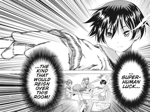
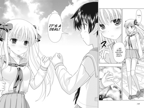 To say that the series did not have any basis in the yuri genre this early would be a baldfaced lie. In fact, the first thing that happens in Saki is Saki remarking on the beauty of her eventual teammate and best friend, buxom digital mahjong warrior Haramura Nodoka. One thing that does fade into the distant background, however, is the sole male club member Kyoushirou, who seems to start the series as a kind of male audience stand-in but eventually becomes all but fused with the background. I think at this point the series was trying to decide whether it would be more of a harem or more of a girls-only world, and it’s come to lean clearly in the direction of the latter.
 Another aspect that’s changed significantly would be the artwork. As creator Kobayashi Ritz’ style has developed, the girls have gotten softer, their features more simplified yet pronounced, and I don’t even mean that only about Dragon Ball Z-esque chest size power creep that has occurred over the years. Some of the girls look very different here than they do in the current chapters of the manga, and both look quite different from the official anime character designs. I personally don’t have a preferred style for the characters.